These are some quick notes. If you’ve got questions about shading/colors lemme know I’ll edit the original post.
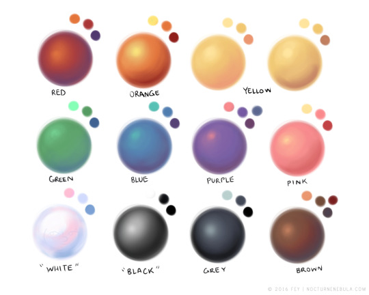
When making a piece I always want to make sure the overal rendering is good. Eyes are drawn to contrast. When you pick your colors make sure there are enough pleasant hues, enough contrasting values, and ENOUGH SATURATED AND DESATURATED COLORS
When you choose to do high saturated flat colors make sure your shadows and lights are desaturated. If you make your lights warm make your shadows cool. For values always check if your piece still looks appealing under a black and white gradient filter. If not, bump up those values! If your piece looks fine in black and white but trash in color HANDLE YOUR SATURATION.
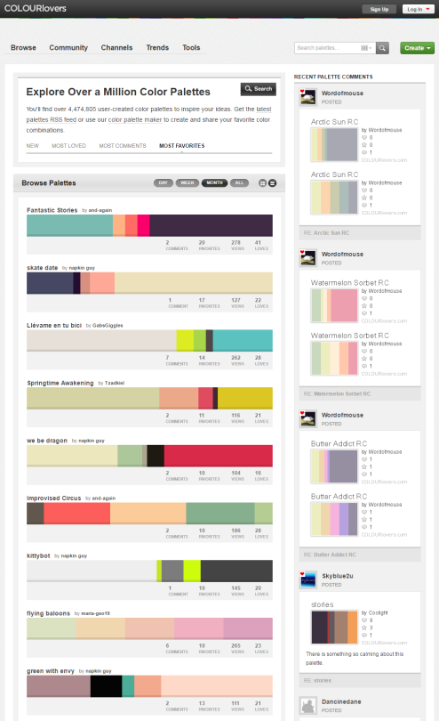
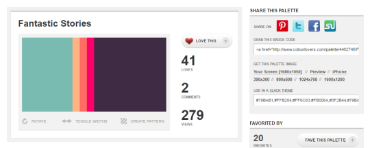
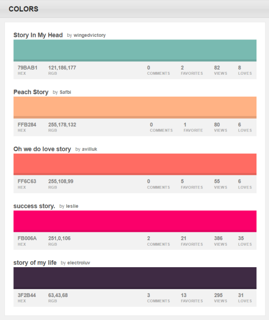
You can browse the most popular ones or search for certain colors, themes, and even specific hex codes!
When you find one you like, you can download a wallpaper swatch of it and also select the specific colors it uses to look at more palettes that use those same ones.
I drastically changed my colouring process over last year and atm i’m not using any fixed palettes. I always start with drawing the entire scene in greyscale:
(I find it easier to keep control over volumes, depths and contrast that way)
And now almost entire colouring process is based on adjustement layers.
I put any Gradient Map (set on Soft Light mode and something between 30-60% opacity) adjustement layer on top of it just to start with whatever:
and then i jump to Curves (my fav tool for colouring) – also added as an adjustement layer – and here i have most of the controls i need over each colour channel separately, so i just keep playing with it until i get close to what i like, very often just trying out various settings, I sometimes spend twice as much time on playing with this tool than on making an actual drawing, cos i often have absolutely no idea where i want to end up with colour XD This is how my “let’s try this now” folder for this piclooked like:
ekhm, anyways…
and then i play with it some more, sometimes using Colour Balance or Selective Colour adjustement layers too
(note: i always keep foreground and background on separate layers, or i make separate masks for each, so i can work on these independently if needed)
and voila:
I’m trying to leave a lot of some room for experimenting and accidental effects (trying out various blending modes and opacity settings) cos these can be very fun and surprisingly nice sometimes, but general rule i keep in mind is the contrast (contrast is always good) between colour temperatures. I have the contrast between light and dark already set in greyscale pic, so here it’s mostly about warm vs cool and most often it goes as: cool shadows / warm lights, cool background / warm foreground (or the other way around, but contrast).
i also like having one dominant colour in the pic so very often i grab selective colour tool and pump up that one chosen colour, sometimes even desaturating the rest of the image to push it out even more, but that depends on the pic.
Cheers and thanks! ❤
P.S.: i wanted to say i like using colour red most, but then i took a quick look at my gallery and i seem to like warm yellow / orange a lot too? especially if contrasted with colder blueish shadows.
it’s such a simple yet hard concept to grasp, right? i’m having loads of trouble starting since there’s no exact tutorial for it, so you’ve gotta broaden your search for the topic.
recommendations:
i recommend watching speedpaints to get a better understanding on how other artists do it
the color study tag on here has loads of pics to take inspiration from
this book called ‘color and light’ by james gurney i’m borrowing from a coworker has tons of stuff that goes deep within the understanding of color (it’s a LOT to take in, i’ve had this for 3 weeks and i still haven’t finished it)
i have a pretty basic understanding on choosing colors so i usually eyeball it instead from reference photos. but if you’re a beginner you need someplace to start, picking colors off the pics would be good, but don’t rely on it too much. it often leaves your drawings pretty bland since you’re straight up copying from the camera lens.
2) keep things quick and simple
you’re doing a color study, not an environmental study. i’m having trouble with over detailing my pieces but i’m making a conscious effort to stop caring since the main focus here is the colors, their relationship with the surrounding (even the sky has fricking layers i need to properly understand)
3) pick a picture that inspires you!
i usually pick out photos who has a clear contrast on stuff, so you’d wanna work on something that really attracts your eyes. google is a friend, don’t forget that. it’s better to reference of real life photos than fanart, and plus movie still/screencaps are a good place to see how the colors work out together
4) study your fave artist pieces
pick a piece you like the most and study it. what makes it attractive to you? why does this shade of pink go well with this sort of blue? you can color pick the piece and study their pattern in picking colors, some artists are using the same sort of color palette and it makes them stand out. try to find out why and experiment that method on your pieces of artwork.
so these are the only things that i have on my plate right now, and i still have a loooong way to go, lol. hope it helps!