I reference from photos for stuff I can’t visualize on my own, and artists like bouguereau, rockwell, leyendecker, mucha for mind fuel
Composition:
Whenever I do a piece, the objective I have in mind is to not get bored, because once I lose interest, I lose the piece.
So for me, the composition has to be distinct enough to avoid echoing an early piece, and to immediately be recognized due to its layout. It’s gotta be new for me, and new things are fun and exciting, right? (yes they are)
I think about the subject, the action, the actual format (whether it’s allegorical, objective, subjective, i.e. is it a symbolization, a certain scene, would you find it in real life? I tend to avoid the latter, because I find it dull and uninteresting and I hhhhhhhate that) I place priority on the human form, it’s versatile and expressive more than anything else, in my opinion.
Here’s an example. Normally I don’t post my sketches since they’re just glorified chicken scratch, but this is the best example I could think of at the moment. It’s St. George (for my series sanctus), and normally, you’d see him like this
(Saint George and the Dragon by gustave moreau, 1889-1890 )
or
(Saint George and the Dragon by raphael, 1504-1506)
this.
It’s a pretty common depiction, since it goes back to medieval times. The similarities are that he’s on a horse, he has a spear/lance, there’s a dragon, and he’s attacking it.
The big picture (haha pun) is that I wanted to also have my subject be st george (side note, it’s kind of the theme of the series), but different enough from past artworks where I’d know it wasn’t enormously reminiscent of the traditional depiction. So I aim to keep the basic idea, and see what goes on from there.
This is the first sketch I did, it was okay, I knew I’d never drawn anything like that, which is good, but composition was lacking. I wasn’t so hot about this, so I dropped it. I kinda like it so I might revisit it . Additionally, though, it strayed a little too far from the main idea.
Above was the second sketch, after I’d finished roughing it out, I knew immediately it wouldn’t do. I was satisfied for about 2 seconds, then I got disappointed and stayed that way.. If I put it side by side with the other million or so paintings of st george, I doubt I could tell it was mine. It was practically the same: horse, lance, dragon. The action was too similar to other portrayals.
Definitely….nah
It’s not as similar as the previous one was, but I didn’t like it. That’s a good indicator too, whether you like it or not. I’d tried to fuse the first and second sketch because I did like the first one somewhat, but it didn’t really work for me. It’s just so awkward …
So I left the piece for a while, and came back and did this. It was different, simpler (which can improve a piece more often than not), and I liked it. After I did most of the sketch, I said great job u idiot it only took you a week to come up with a sketch the hell is wrong with u, went to bed, and woke up happy, and normally it doesn’t take me 3 actual sketches or something to come up with a good piece, and I was getting pretty fed up before the last sketch, but good thing I didn’t give up (this time. hah) This is basically how I go about my pieces for now.
tl;dr Don’t give up! (haha I lied, go back and read)
This is honestly a very loose, general rule of thumb when you’re considering how to put together a drawing – take everything I’ve said with a grain of salt (and a dash of your own experience), because composition and flow is super subjective
this is just some shared personal tips based on my own learning – but I hope it helps anybody who might be struggling n_n
OKAY SO! @biazerod asked me a little help on storyboarding and i decided to make this tutorial…i’m not a professionist. so don’t take these as golden rules…just advices! and as always sorry for the english
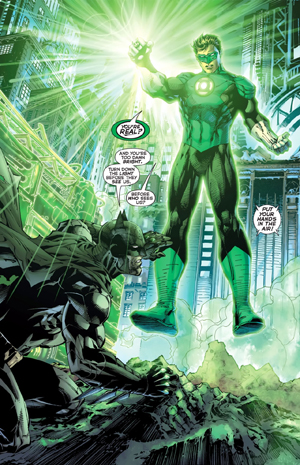
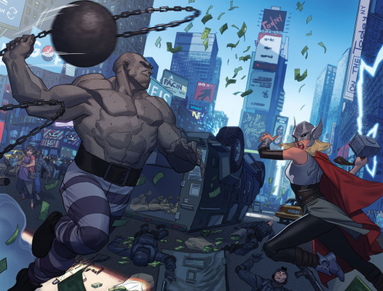
FIRST THING FIRST! the storyboard part is the most important phase in a comic page ! you can spend an entire day storyboarding! because it’s the structure, the essence of the page! here’s some tips : 1- a page can start from 1 panel/frame (called splash page!) until how many f*cking panels you can fit ! (some pages , especially in french comics/bd can reach 24 panels/frames!) Exaple of splash pages:
(these are from the green lantern,DC and the newest Thor ,marvel ) Splash pages are a priority of American comics, you rarely can find them in french Bd ! they represent a scene of impact! a fight! a revelation! be careful! use it only one if two times on a range of 50 pages! cuz it cut the narration! instead in french bd you find this :
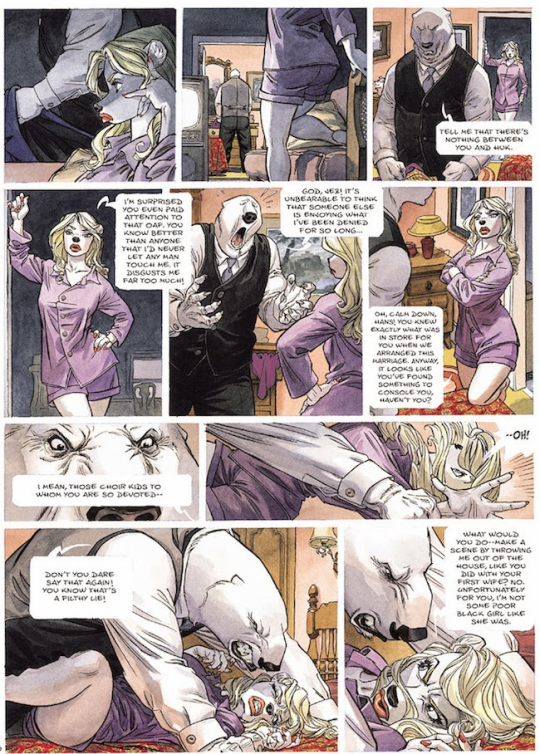
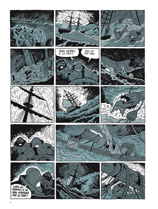
first one is from Blacksad 2# and second one is from Atar Gull see how high the number of the frames is??
the number of frames is very important in a page because it decide the narration time! 😀 also it all depends on the kind of ‘’direction’’ you want to use on your comic! so be really careful when you decide the number of the frame! LET’S PASS ON THE CREATION!
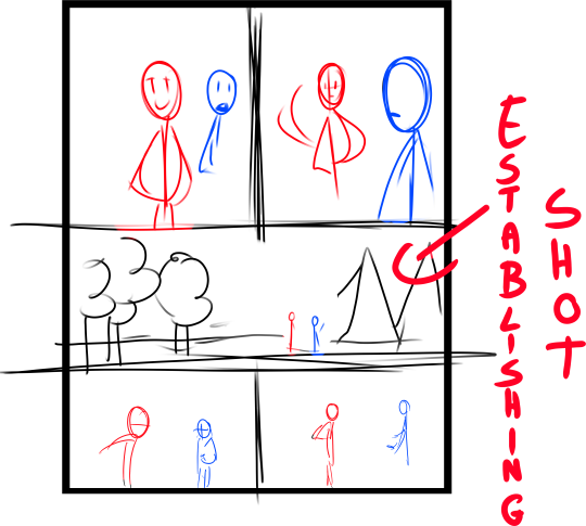
1- when you have a page that contains more than 3 Frames ALWAYS. ALWAYS HAVE AN ESTABLISHING SHOT!
the establishing shot is fundamental! BECAUSE READERS CAN UNDERSTAND WHERE THE CHARACTERS ARE!
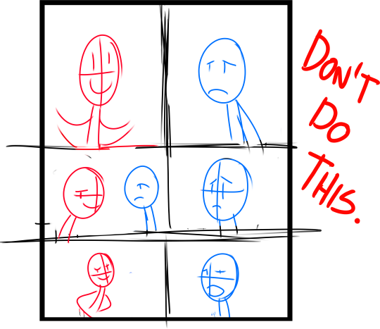
DON’T DO A COMIC PAGE FULL OF FACES !
DON’T DO THIS! LET THE CHARACTER BREATH! LET THE READER BREATH! PLAY WITH YOUR CAMERA! YOU HAVE THE POWER! in a comic page, is important to put the camera far away from the character most of the time! play with the different shots!
(found this on google) WATCH MOVIES AND TV SHOWS. lot of them can help you so much you have no idea! a comic artist and a director do the same job when creating a story
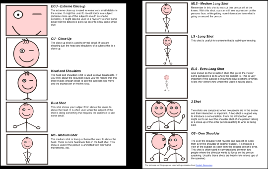
2- Candy eye this is a tricky trick that can help you with the audience! when a character is saying something important or you have to introduce them , USE THE CANDY EYE DUDE.
the candy eye is , basically, a bust shot where you show the character,their features , usually with a cool or a funny expression ( or of course it depends from the situation) and believe me WORKS 10/10 with the audience 😉
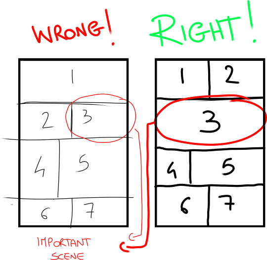
3- HIGHLIGHTS THE IMPORTANT SCENE IN THE PAGE!
FINAL TIPS: – when you’re doing dinamic poses try and try again! the first one isn’t always the best! -USE REFERENCES. –A STORYBOARD PAGE CAN REQUIRE EVEN 4 HRS IF NOT AN ENTIRE DAY IF NOT AN ENTIRE WEEK. REMEMBER THAT THE STORYBOARD IS THE ESSENCE. AND THE REST IS DECORATION. – IMAGINE THE SEQUENCE! NOT THE SINGLE PAGES. THINK IN SEQUENCES! imagine what would happen after the page you are creating! connect the various pages NOT THE SINGLES FRAMES ! YOU’RE CREATING A STORY! NOT A SINGLE ILLUSTRATION! -AGAIN DON’T DO PAGE OF FACES. most important thing:
if the page you’re creating it stresses you! STOP. continue it when you are in a better mood ,dude. our job requires lot of time and effort, but it should be the job we love. so don’t stress yourself and keep calm.
hope this is useful. don’t take this as golden rules, this is just the way i work 🙂