hey yall its me the Art Mom™ to help you shade pretty
rule 1: DO NOT SHADE WITH BLACK. EVER. IT NEVER LOOKS GOOD.
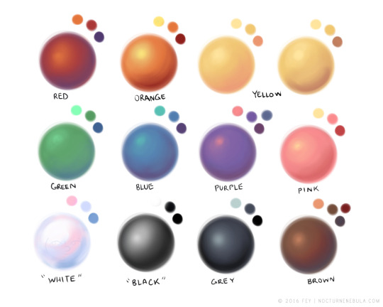
- red– shade with a slightly darker shade of purple
- orange– slightly darker and more saturated shade of red
- yellow– i think like..a peach could work but make it a really light peach
- green– shade with darker and less saturated shade of blue or teal
- blue– shade with purple
- purple– a shade thats darker than the purple you’re using and maybe a little pink (MAYBE blue)
- pink– darker shade of red
- white– a really light lavender or blue..or i guess any really light colour??
- black– okay listen dont use pure black to colour anything unless you want to leave it with flat colours because you cant really shade black lol
- grey– a slightly darker shade of purple or blue (less saturated)
- brown– slightly darker and less saturated shade of purple or red
aaaaand thats all i got lol. let me know if there is anything i should add to this list!!
If you’re a visual learner…
I made some Balls of Colour to go with Art Mom™’s post:
Tag: shading
Tips on shading?
Hmm you’re incredibly vague so I just did a process thing. Hope this helps!
Also generally don’t shade with black/gray unless you know there’s a certain look you’re going for.Et voila! Sweet little sugar free lolly gunslinger Kyle as reference :’D Feel free to change up the shadow colors to get different effects. Have fun!


