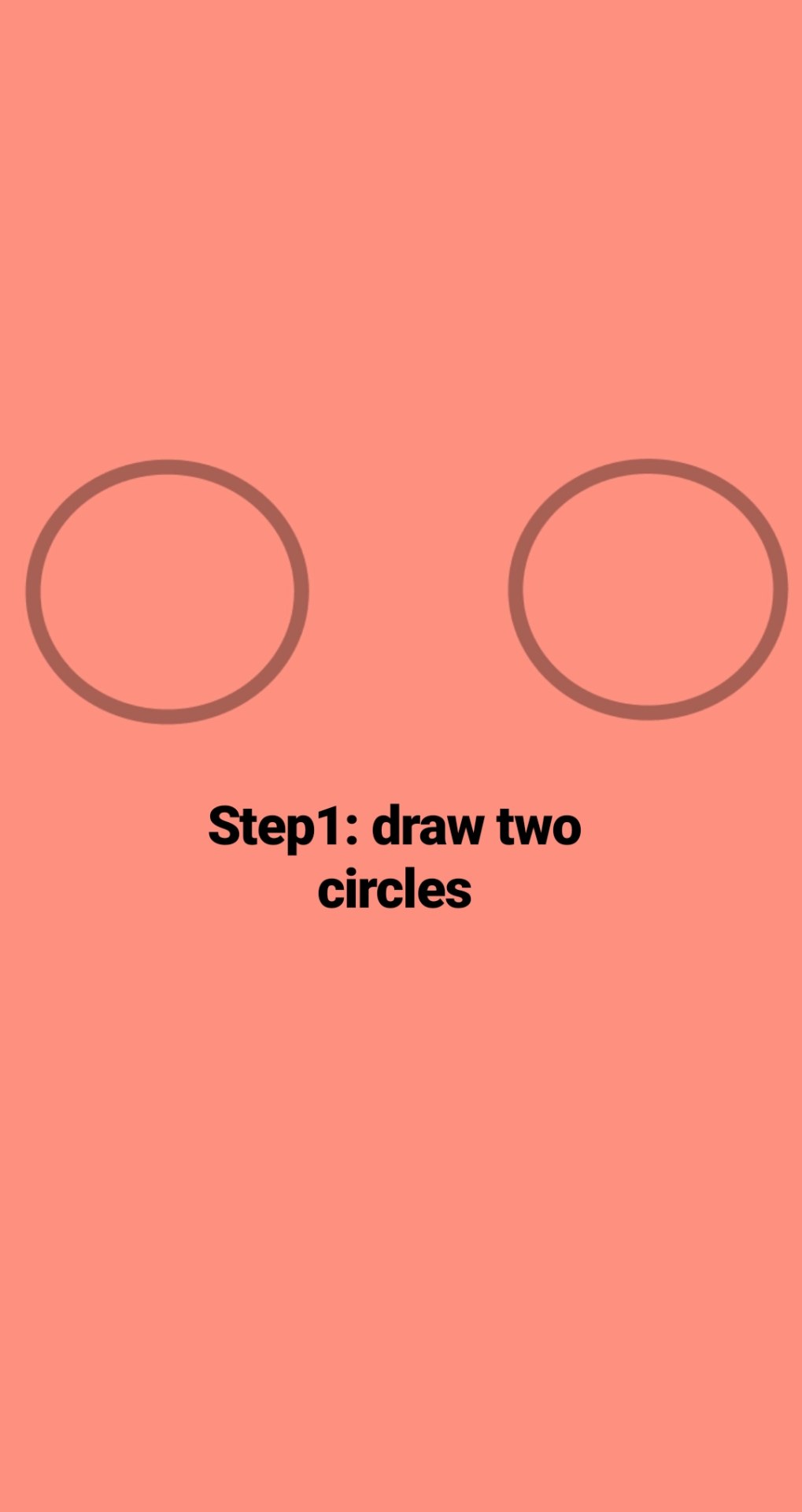
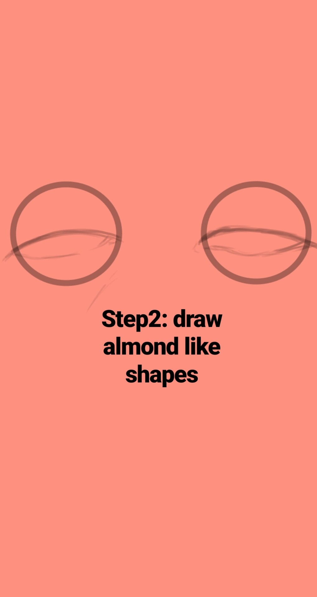
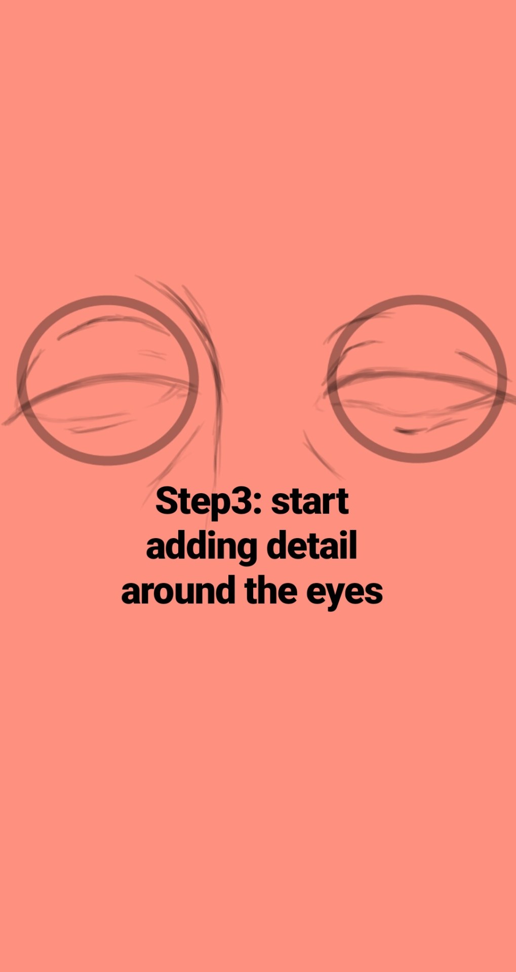
I’m awful at explaining things, but heres my best go.
First things first, firealpaca is a new art program that is free. You can download it in any language for mac or pc and it works pretty nicely. You can download it here.
Here is how I set up my artboard. Tools are on the left, layers and a preview are on the right. If you ever loose a window, you can click “windows” in the top. You can find save, new file, and open file under “file.” Undo, Redo, Copy, past, ect you can find under “edit.” New layer, fill, clear, rotate, ect you can find under “layer.” Select, Deselect, inverse, ect you can find under “select.” To have the pen or tool snap to a certain line and only draw in one direction, you can find under snap. Color gives you the option of a bar or wheel. "Tools" is basic tools, all of which you can find on the left of your screen as well. "Windows" controls the different windows open such as layers, brush control, color, ect. Help will find you certain tools incase you get lost or need assistance with a problem.
I am working with a mac, not a pc, however the set up and tools are pretty much the same from what I’ve heard.
I’ll start off by explaining how to make a new page, the brushes, and the tools that come with Firealpaca. Like most art programs, you can import different brushes and such to use. It gives you a few basic brushes to start out.
You can either go to the drop down menu under “file” and select “new” to make a new file, or you can use command + N if you’re on a mac.
This window will appear and you can choose the size of your file, the dpi, and the initial layer format (color or 8 bit). I usually work in 2000×2000 unless I’m doing a commission, then it varies around 4000×4000.
Here are the different brushes. You can see their textures below. If you want to edit any of the brushes, just double click on them and youll get a small page to edit the name, type, width, size, and opacity settings.
Those are the main brushes I use when I’m drawing. I use the pen for most things, but I like to paint with pencil and watercolor as well. I have two custom brushes that I use for blood, but nothing else really. The eraser brush erases and the firealpaca brush lets you draw with the firealpaca symbol. I don’t ever use it so I didn’t include it.
Firealpaca also gives you a nice little preview of the brushes when you’re using them. Here you can change the size and the opacity of the brushes really quickly while drawing incase you need a thicker or thinner or less noticeable line.
Above that I have my color palette. I only have saved Bubble, Mod, Carousel, and GhostBunnies colors. To add colors, you click that cute little page button. To delete one, you click on it and click the trashcan button. Be sure you add them in the order you want them because you cannot move the colors around.
These are your tools. They’re pretty basic. Pen for drawing, Eraser for erasing, Dot brush for pixel art, v for the normal arrow tool that I call the grab tool, shape tool for drawing basic shapes (shift does not keep them at the basic size so you will have to eye it), the bucket tool for pouring colors, gradient tool for basic two color gradients, select tool for selections, I dont know those next tools names, I think theyre drawing selection and erasing selection or something, but you can draw with them to make selections which is pretty cool. I usually use the lasso tool though. Text tool for text, however you are very limited with what you can do with text. You have quite a few font options though! hold down option to get the eye drop tool and hold space to be able to move around the drawing if youre zoomed in.
I’ve included the quick keys so you don’t have to go over and click the button every time you need to use a certain tool. Down below you can see the options you get with each tool. The tool options appear at the top of the program and change depending on which tool you are on.
For the pen and the eraser, you get the snap tool (quick keys 1,2,3,4 and 4) which just makes it so you can only draw straight lines in certain directions. You can also draw a straight line by making a dot, holding down shift, and clicking where you want the straight line to go. AntiAliasing makes the lines texturally smoother, and then line correction makes them visually smoother.
The dot brush you can choose your pixel size, anywhere between 1 and 3. This is good for if you’re doing pixel art.
For the shape tool, you can choose your shape (you have rectangles, ellipses, and polygons), you once again can choose antialiasing or not, and for rectangles you can choose to have round corners and the percent of how round they are! You can also edit the opacity of the shape.
For the Bucket tool, you can reference either the canvas or the background. Once again you can choose antialiasing or not, and then theres the expand option! This is important if you are going to be filling or coloring with the bucket tool! It will expand your coloring 0-3 pixels so you dont get that white line between the color and your outline.
Gradients you can choose weather its Linear or circular and you can choose if its forground-background or just background.
The select tool lets you select a certain part of the drawing, for example if you want to cut it out or move it. It gives you four shape options, I usually find myself using the lasso tool when I’m cutting out certain parts of the drawing. If you grab a certain part and realize you suddenly want more, hold down shift while you are selecting and it will just add onto the selection instead of starting anew one.
If you are going to be moving your selection, you must have your move tool over the selected area or it will move the entire layer.
For the drawing selection tools, your only option is antialiasing.
Here is the right side of my screen. I keep the navigator small and it just gives you a preview of the art board. You can zoom in/out by clicking the magnifying glasses or command + +/-. You can zoom to a certain selection by the blank magnifying glass. You can twist the layer by pressing the circular arrows or keyboard right/left, and you can go back to the original right side-up by clicking that cool line circle thing.
Then you get to layers which is very fun. You can change the opacity of the layer with that pink bar. Lower opacity means it will be clearer, higher opacity means it will be stronger. I only change the opacity when I am trying to differentiate between layers or when I am drawing lineart over a sketch.
You have these lovely blending options.
I cant explain them without sounding dumb so I wont try, but Multiply makes the color darker, add will make the color almost white and it will make an airbrush look crazy bright. Great for lighting up sparkles or doing shines on the hair. I dont use overlay or screen much.
Protect alpha will protect the lines under it, a clipping layer will only let you draw on whatever its clipped to, and locking a layer will make it so you cannot draw on the layer at all.
When making a layer, clicking the blank page will get you a new layer, clicking the 8 page will make you an 8 bit layer, clicking the two pages ontop of eachother will duplicate the layer you are on, clicking the page with an arrow will merge the layer to the lower one, and clicking the trashcan will delete the later.
…
Yeah that’s all I got. I’m horrible at explaining things, so I’m sorry. xD but best of luck!
random thing but i realized it might be helpful for some people so uh. theres this thingy where you can upload an image and it gives you a color palette based on it !
heres an example
and it also gives you the hex code values for them too its p neat !
Yes, we haven’t done this in a while… but our inbox and chat are swamped with questions on the subject, so this article was very much needed.
it’s a simple list of art apps, but we know you love those 😀
Enough with the intro, here it is, a list of twelve art apps you may want to check out.
ArtRage is an art program for beginners and professionals. With its minimal interface, it’s easy to keep the essential tools at hand without stealing space from the canvas. Panels can be moved around and tools can be customised. We all know how important it is for digital artists to be able to modify brushes!
Pros: easy to use; friendly interface; essential tools from professional apps available; available for iOS, Android, Windows and Mac
Cons: it may get sluggish with big files and when using big brushes, but performances also depend on the running machine; limited selection of editing tools if compared to Photoshop – ArtRage is more of a painting program rather than an editing one.
Paid
ArtRage Lite is a different version at a cheaper price, mostly for beginners, but also for professionals if they need the essential.
Now free, Sketchbook is the famous app created by Autodesk for various platforms.
Pros: clean, friendly interface; easy to use; professional features
Cons: lack of official tutorials; doesn’t offer as many tools as other apps (it’s down to the essential); paid subscription in Adobe style for the pro version
Free and paid
Black Ink is a powerful little program few actually know, but there’s a reason: this isn’t your classing drawing app. What’s cool about it is the vast selection of special brushes, completely non-realistic, and definitely able to boost your creativity.
Pros: vast selection of customisable brushes; excellent performance
Cons: not very easy to use; non-intuitive interface
Paid
This is probably the most complete software for painting, drawing and animation. It was originally known as Manga Studio, but with its updates and addition of features, it became Clip Studio Paint.
This doesn’t say much about the quality of the features themselves considering the affordable price (if you haven’t used the app yet, that is), but among graphic apps, this one is the top seller.
Pros: professional features for illustrators; layout tools for comic/manga artists; 3D reference models; customisable tools; various sales with special prices
Cons: the interface may not appear intuitive at first; the program may lag (again, performance also depends on the running machine)
Paid
GIMP is the famous open source image editor originally created for GNU/Linux and available for OS X and Windows.
Best known as Photoshop’s main competition, this is a manipulation program for both beginners and professionals who love design.
It offers many professional features, making the program a powerful tool.
Pros: professional editing tools; supports different formats; supported by different platforms; active community
Cons: in spite of the simple design, many options are hidden and it takes time to discover all the features; slow startup
Free
Krita is an open source painting app created by artists for artists.
Pros: easy to use; intuitive interface; great brush workflow; brush stabilizer; customisable brushes; general good performance; very enthusiastic, although small, community
Cons: it may be slow or even crash depending on the running computer and the app’s version; very few editing tools compared to Photoshop
Free
MediBang Paint is a free and light app for drawing and painting, perfect for manga and comic creation.
Pros: vast selection of brushes; cloud sharing; friendly, minimal interface (non-desktop app); also available for iPad, iPhone and Android
Cons: requires an account to use all features; non-intuitive interface (desktop version)
Free
Mischief is a sketching app with essential tools, useful for brainstorming and ideation.
Pros: infinite drawing canvas; friendly interface; easy to use; cheap pro version
Cons: few updates; offers only the essential (but that’s the point); no editing/adjustment tools
Free and paid
Corel’s jewel, Painter is the most famous software that offers digital tools able to give a traditional feel to brushes and canvas.
Pros: different selection of media; many professional features; PS-friendly
Cons: certain brushes may work slow; not easy to use at first; the software may crash (this is the most common report); pricey
Paid
Paintstorm Studio is a professional software for digital painting. It’s focused on the use of brushes and blending, which makes the software a little gem in the digital painting field.
Pros: good brush workflow; brush stabilizer; “close gap” feature; customisable interface and tools; professional features; affordable price
With the very sensitive Apple Pencil, Procreate is so easy to use that many artists chose the iPad over the most famous graphic tablets.
Pros: friendly interface; makes it easy to organise files; excellent brush workflow; customisable brushes; video recording; affordable price
Cons: hidden features; only available for iPad
Paid
SAI is a simple app for artists who want to focus on painting and drawing.
It’s well known for its good pressure support and its essential tools for manga artists, but SAI can be used by any kind of artist who wants to paint.
Pros: easy to use; friendly interface; light software; customisable brushes; tons of (non-official) tutorials
Cons: limited selection of tools, even basic ones; limited canvas sizes and uses; it might crash from intensive work, especially with big canvases and brushes; supports only RGB colour mode; lack of support
Paid
We hope you’ll find this list useful.
If you think there are other apps that should have made this list, don’t hesitate to let us know!
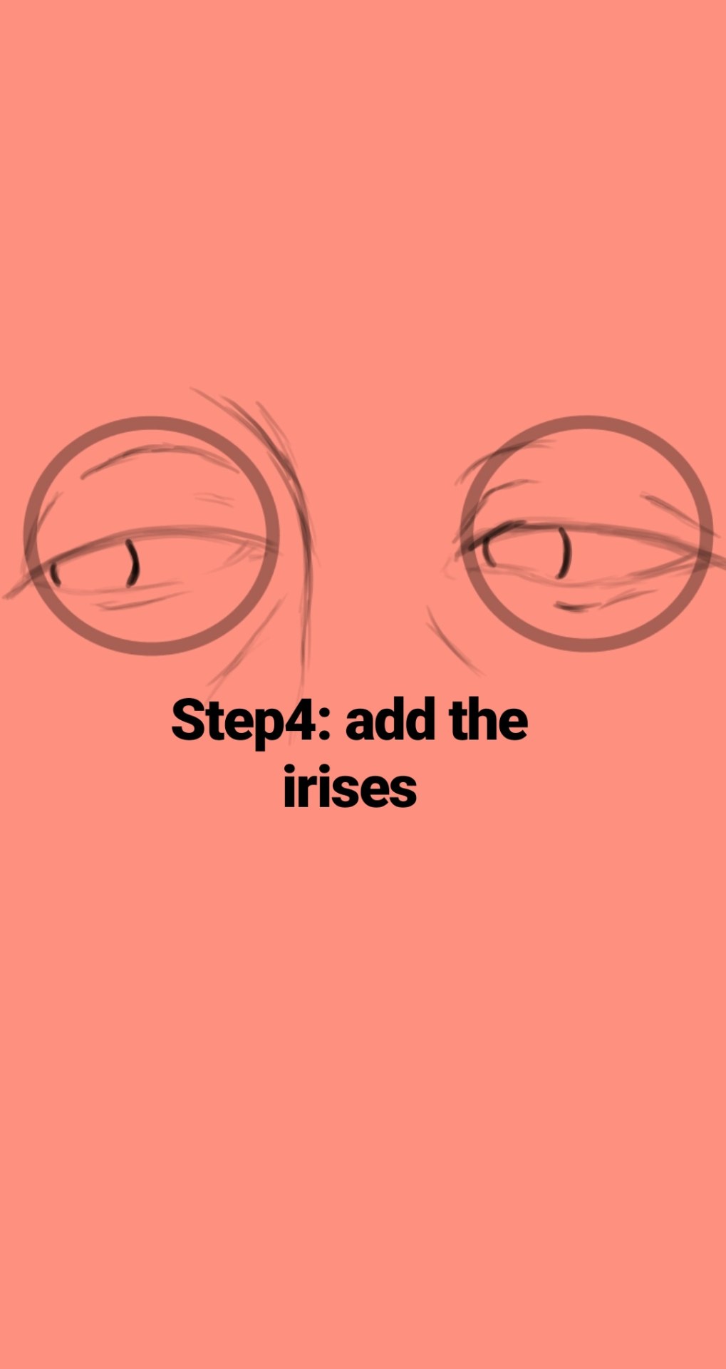
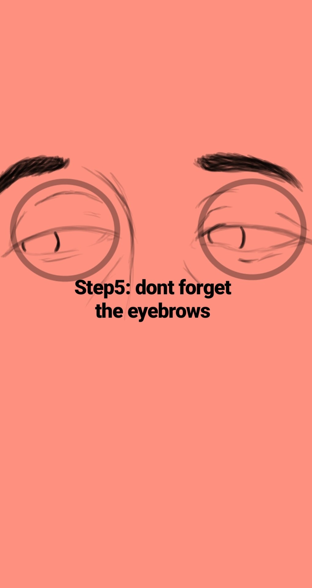
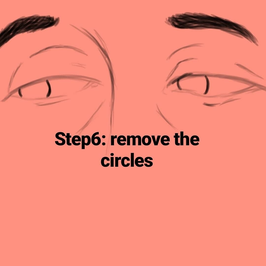
Hi y’all! Folks wanted me to explain how I draw mouths, so here it is! Nothing super complicated, just a really quick and simple demonstration. Another quick note I’d like to add- I’ve always been taught that you should never learn to draw features outside of the face. For example – A lot of young artists will recognize that they need to practice drawing eyes, but then after hours/days/weeks of practicing they find themselves unable to work all this new drawing ability into an actual face. Same thing goes for mouths/noses/brows etc. Get the bulk of the work out of the way on the first attempt! Draw the whole lower half of the face!
It’s basically a massive database full of high-quality images of different hairstyles. I mean, look at all the options in that sidebar (and part of it’s cut off):
In total they have 976 pages of hairstyles with about 17 styles each, that’s about 16592 hairstyles to look at.
Just a quick thing I put together. This blew my fucking MIND when my anatomy teacher pointed it out. My drawings instantly got better. You might know it (good for you, I wish I knew it before too T_T) or you might not and it might help you get better.