I’ve been asked a lot about tips for aspiring animators, so here are some ! Enjoy, I hope it will help some of you.
Oh, and for the ones wondering who I am, I’m a french 2D animator. I studied animation at Gobelins like 10 years ago and ever since I’ve been mostly working as a 2D animator for feature films, commercials, shorts and shows.
It’s ironic that I work in education but I don’t know how to make an art tutorial, so here’s my sad attempt! Forgive me if it’s useless.
I LOVE drawing hair, it’s always been my favorite, although I’m a bit of a perfectionist and therefore hair is usually the part that takes me the longest when I work on a piece. It involves a lot of experimentation and drawing the same lines over and over until I get the right shape or flow and it requires a lot of patience (at least for me). Is there a right way to draw hair? Of course not! That’s the beauty of it. Every artist is unique and will have their own style, it’s all about trying new techniques to see what works best for you. *blows kiss*
Okay here we go!
I generally have three main steps: a loose sketch, a more refined sketch to build a cleaner design, then the final lineart. I also tend to make about 3 or 4 sketches to find the right hairstyle or flow. (I’m also indecisive as f**k)
Things I think about:
Action, dimension, shape, flow, movement and how it’ll interact with the body or what’s around it
Is there wind? Is the character outside? What are they doing and how would the hair respond to that? Is it pulled behind the ear? Wrapped around the neck? Tied up?
References and inspiration – I always use a reference of some kind just to remind myself what I like or what I want to see, it’s the best tool to keep myself on track. Sometimes I even use my own art just to see what how I’ve done it before and what I liked about it. Don’t be scared of reference! (Example: Alphonse Mucha’s art is a major inspiration, I LOVE his use of line weight, shape and flow)
Using Gladio’s face from a wip I’m currently working on, I tried to draw some of my process out:
(Is it blurry!? Did I screw this up? Oh well, let’s keep going!)
Steps:
Sketch – Loose and messy gesture lines to show the general shape and movement. It’s okay if your sketch looks like a hot mess, it’s supposed to!! I have a hard time staying loose myself, so I’m working on that. Usually my sketches are very dramatic haha.
Refined Sketch – This is where I start to actually define the strands and the general shapes. By using my sketch as a guide, I can then build the design and the more individual strands and how they interact with each other. This can take a while (like it takes me hours). I try to go slower and I’ll end up reworking it a few times before I’m happy. Tip: reverse your canvas! It helps you see if your hair is more or less balanced or if something looks off.
Final Lineart – At this step, I strengthen my lines and erase lines where I want the flow to be more continuous. I also add detail lines and extra strands or flyaway hairs for a more interesting or complex design. The example above is still too messy or simple for what I normally like, but that’s okay. Also, what the heck is up with that messy bun? What am I even doing?
Final points:
Find inspiration and examples of what you like! This can be from other artists, movies, nature – literally anything. References are your best friend.
Experiment and try new things – I’m always trying to push my designs further and learn new skills
Keep your sketches loose and messy! I like to warm up by drawing circles, ovals or like the infinity/8 shape over and over again.
Play with line weight and thin vs thicker hair strands. Have the hair interact with something, whether it’s an ear or a shoulder or itself. Push yourself for an interesting design. (Gotta push myself too! It can be a frustrating process)
The more you practice, the better you get (cliche, but it’s so true)
Honestly, I don’t even know what I’m doing half the time and my skills have a long way to go. So we’re on this hair journey together! ❤
BONUS!
Here are a couple Gladio sketches that I never posted on tumblr as an example of a messy sketch vs a more refined sketch
Apparently I really like drawing Gladio shirtless Okay hope this was somewhat useful! ❤
These are some quick notes. If you’ve got questions about shading/colors lemme know I’ll edit the original post.
When making a piece I always want to make sure the overal rendering is good. Eyes are drawn to contrast. When you pick your colors make sure there are enough pleasant hues, enough contrasting values, and ENOUGH SATURATED AND DESATURATED COLORS
When you choose to do high saturated flat colors make sure your shadows and lights are desaturated. If you make your lights warm make your shadows cool. For values always check if your piece still looks appealing under a black and white gradient filter. If not, bump up those values! If your piece looks fine in black and white but trash in color HANDLE YOUR SATURATION.
some tips and tricks that have seriously helped me in excelling at watercolour
1.PAPER WEIGHT. for the love of god do not use any paper under 110-120 lbs to paint with watercolour, a very VERY wet medium that will soak clean through the paper if it’s not thick enough (most paper pads sold at craft stores have the weight listed on them. printer paper is around 20 lbs, sketch pads will be about 60 lbs, IDEAL watercolour paper 140 lbs+). i use only 140 lb paper for my serious watercolour works. canson and strathmore are my favourite brands
2. there’s no need to have very expensive watercolour paints, but it is important to use something better than crayola. my dad gave me a 24-pan windsor&newton watercolour set when i was 8 and these are still the paints i use today (i was a very careful child, but i never even had to replace my paint pans after almost 10 years either, so this brand, while super expensive, lasts and earns my gold star.) some other cheaper options are: x and x
3. if you’re going to be using watercolours, prepare to use WATER. so many people forget this, but it’s so important to realise this media is meant to look translucent, so you should see the paper through the paint. if you can’t see it, then you’re using the paints as if they’re gouache or acrylics, so try using more water and work with lighter colours.
OKAY NOW FOR THE ACTUAL TRICKS
4. SALT
quite overused in watercolour but it’s so freaking cool it can be pardoned. *remember for all of these effects, you have to use lots of water with the paint for it to work!
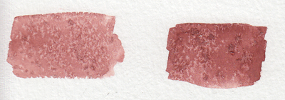
5. ALCOHOL/VODKA/HAND SANITIZER IF YOU’RE LAZY LIKE ME
you have to be very careful here because the second image can turn into the first if you use too much alcohol and it soaks through the water and paint gets in the spot, so be sure to experiment plenty before using this!!
but yeah you can use whatever clear alcohol you can find and it does p much the same thing
6. LIGHT SKIN TONES
okay while the darker skin tones are more easily achievable with browns and additional yellows/blues/reds to bring out the undertone, light skintones are hard as hell to make with watercolour because it’s hard to even think of what to mix. think no more!
YELLOW OCHRE + ANY PURPLE = perfect skintone you can play around with. adding more of yellow or purple will give you either cool or warm skin tones you can build up on and layer until they’re the proper value. remember to use purple/cool shadows with skin in compositions with normal lighting!
7. PAYNE’S GREY
and finally to repeat my previous post, use PAYNE’S GREY instead of black for a richer, darker colour in your painting. don’t use black unless your entire composition has warm colours, but even then, try to use a very dark brown instead of black.
8. WHITE
finally, it’s very important to mention this: never use the white watercolour they sometimes give you. EVER. EVER. dilute your paint with water instead to get a lighter value, or else you’re not using watercolour to its full extent (which is something you might struggle with if you’re used to using acrylics or oil)
—
that’s all i can think of at the top of my head, but if you have any questions or need further brand recommendations etc, feel free to message me!
I use watercolors like acrylics- heavy amounts of paint and I get wonderful jewel tones out of it that seem to glow as a result. So, to each their own, but there’s some fun tricks in here!
It’s here! For those artists who spend loads of time trying to figure out why their art is not coming out the way they want it to be, making thumbnails (or making studies) is the thing for you! It’s also great of getting rid of the habit of zooming in.
This is how I draw hands. I simplify the shape and then later I will add the necessary details. It makes it easier to get them right. But the only way to learn how to draw hands is to just keep drawing them.