Here are some tips that help me draw people that look like actual people
References from the internet are good, but references you make yourself are better
Why tho? Because we know what we look like. How we move, what our body does when it twists and turns – we know our own bodies far better than any stranger’s. Taking pictures of yourself in crazy poses helps not only put your own personality into the characters you draw, it gives you a better understanding of anatomy and pose dynamics. Even if you aren’t a model, every human is expressive in their own way, and chances are the fact that you aren’t a model is going to put a lot more realistic depth and likability into your drawings. Why do you think folks at Disney, Laika and more depend on their own footage other than one’s handed to them?
Here are some of mine. I will embarrass myself for education.
Draw the human figure every chance you get
I know we don’t all have access to top notch figure drawing classes, but I’m assuming we all have friends (?) that would love to jump in and pose for us every so often. I try and do a session of 1 min poses daily before I start work on my comic. It helps my mind think three dimensional and it’s fun to see yourself improve as time goes on. PLUS you can always go back to a drawing you like and reference that in another drawing too! There are websites all over that have free image drawing sessions you can choose from. Or you can be a creep like I am and go sit in public places and sketch people from afar (or even just go up to them and ask to draw them, I find most people are flattered and don’t mind at all). A good idea is to switch every now and then between pencil and pen. I know, pen is scary, but so is growth. Go nuts.
These are from when I first started figure drawing. Don’t do what I did and leave out the hands/feet just because they’re hard.
Capture the pose now, add your own style later
I don’t want to start an art student fight on Tumblr, so I’ll just say this: Ya can’t add the pzazz if you don’t have the pza. If your foundations aren’t strong, guess what, you’re drawing is going to suffer. You can try and hide it with your own stylistic choices, sure, but anyone artist or not can look at a drawing and tell that something is “off” when you don’t have your fundamentals down. Take – your life drawing – seriously. I understand that not everyone LOVES to draw bottles and bowls for three hours, I get it. But if you can’t draw bottles and bowls in front of you correctly, how can you expect to draw bottles and bowls from your noggin correctly? Remember this equation: (Fundamentals)pza + (Your own thang)zz = pzazz.
Cute drawing, right? Wrong. This doesn’t even make sense. Let’s play a game called “how many mistakes can you see in this old drawing” of mine?
Accept that drawing people is the hardest thing to draw and take the time you need to make a good drawing
Whoever says that drawing people is easy is lying.
Ask all the professionals out there, drawing the human figure takes practice, practice, practice.
Folks who have been working at Disney for years are still required to enroll in company exclusive figure drawing classes daily. There are days I can whip out a model sheet in thirty minutes, then there are some days it takes me a good two hours to get a face to look right.
You WILL learn the more you do it, but that’s assuming that you are dedicated and will set time aside every day to challenge yourself and take your work seriously. If you desire to go into the animation industry, or any art occupation for that matter, expect the people hiring you to ask you for figure drawings in your portfolio.
literally most things that people write off as just ‘textures’ to use in graphics are stolen & unsourced material created by artists or photographers NOT meant to be used as elements in projects without royalty payments. you can say ‘it’s just random tumblr posts they don’t care’ but you wouldn’t want someone to take your work and edit into their work so they can be praised for their beautiful style and creativity even if they just post it on social media w/o profit, would you?? so maybe if you browse pinterest or google images for pictures without finding the original source, you’re using images that you’re not allowed to use without realizing it.
you see it on here a lot especially in (i won’t link anything but i’m sure you know what i mean) those album track ‘aesthetics’ posts, au ‘aesthetic’ posts (you see these less in kpop, but where people use non-royalty free images to kinda craft a visual au), and even just rather typical graphics that have a lot of ‘texture’ elements. and texture packs too!! that’s often where the problem starts; people just collect images (often literal art), compile them in a folder w/o sources, then insist no one can repost those images w/o crediting the person who compiled them. what???
SO may i suggest some of my fave places you can get FREE, ROYALTY-FREE elements that are totally legal to use
Im pretty shit at explaining things so i’ll use this for basic example. Firstly if you know how shadows work and stuff then it shouldnt be to hard. Otherwise go study that shit.
So you got your flat colors down for the first step
Next lay down a dark tone set to multiply, idk about 70% i guess? up to you
Start adding some shadows set on another multiply, shadows can be however dark. 50-70%
The add your light source, i used color dodge in this one. Dont use super bright color or it will look like blinding light. (again if you know light/shadows shouldnt be to hard)
I add a touch more dark in the shadows for effect…or something like that.
And there you have it, this maybe helpful lesson was brought to you by a potato, chur.
Feel that your drawings are stagnating? Maybe there’s something missing? For those struggling with their styles and finding inspiration, this might be the thing for you!
a small glitter tutorial that is badly cropped and vague i am sorry
hopefully this helps some people though!! This tutorial is for clip studio paint or photoshop mostly but im pretty sure you can do it with any program that has particle brushes!
The external oblique is that muscle that covers the side of the torso (partly on the front and on the sides of the body).
It’s formed by 8 portions per side, each one attached to a rib: the upper fours – thoracic portion – can be seen as four fleshy stripes in hot males muscular figures, while the bottom fours – flankpad portion – are usually perceived as a one thick bulbous shape. The waist stays at the conjunction between thoracic and flankpad portion.
This muscle actually covers the frontal abs too with a super thin kind-of-like cartilaginous surface. Under the flankpads, a ligament goes from the ASIS of the hips down to the front of the pubic bone, with a thicker line that forms a rather visible “V” shape. On women, this fold of the groin is rather curved, while on men is more angular and since it’s extremely sexy, is also called Apollo’s belt (or Adonis’, if you prefer ^^).
The external oblique muscle helps you move your upper body, of course. With the help of other muscles, it lets you flex the vertebral column and bend at the waist to the front; it also assists in lateral flexion (see Cullen stretching down here), or to rotate your torso on the horizontal axis, so with your feet facing forward and your upper body facing sideways (like Ellyna). The muscle’s shape stretches or compresses when doing these movements, of course, so remember it when drawing certain poses. One more thing to notice in Ellyna’s pose is a “tension line” (force?) that goes from the muscles of the neck, through the strenum and down to the pubic bone, and helps describing this twisting movement.
I’m about to start working on a new print, so I thought I’d share my process on how I begin my larger pieces! this is by no means the only or definitive way to begin your artwork, this is simply the method I’ve devised for myself over the years, and is something that works for me 🙂
1. Brainstorming
ideas for finished pieces almost always begin in my sketchbook. sometimes they come from just aimless doodling, but other times I go in with a more dedicated gameplan. in this instance, I didn’t really have a concrete image in mind, so I started with brainstorming before I even began drawing. this is a method I learned in my first year of art school, and while I dont do it often, it’s a super useful thing to do for when you’re stuck. I like to make lists of things I want to include in a piece (like motifs, color palettes, etc.), whenever I’m unsure of where to start. from there, I start roughly playing around with compositions and orientations, trying to include as many things as I can from the list.
sometimes I make notes to myself in the margins of my thumbs. they’re usually clarifying notes/reminders, or critique/feedback I have for myself as I draw. be honest with yourself on what works and what doesn’t.
every artist has their own shorthand when it comes to thumbnails. mine are sometimes so unreadable that they only make sense to me. but thats okay! its how thumbnails should be.
2. Thumbnail
once I’ve decided on a thumbnail I like, I scan it into my computer, blow it up to proper size, (in this case, 9′′x12′′), and make any adjustments as needed. though I try not to fiddle with it too much – that would defeat the purpose of having a thumbnail in the first place. the only changes I really made to this thumb was flipping it horizontally, because I wanted to include Ellie’s tattoo, and also have the composition better compliment TLOU1′s box art, which is the main inspiration for this piece.
3. Gather Reference
this step is super important! even if I don’t refer to them much in my initial sketch phases (steps 4-6), I like to get this step out of the way early on in the process, so I dont waste as much precious drawing time hunting down images. I make a reference moodboard in a separate photoshop document and keep it open in a window while I work. even though I’ve drawn Ellie before, which helps, I needed clear images of her new design for this piece. I also took an image of TLOU1′s box art, because I wanted to borrow that composition. and lastly I gathered a few closeup images of her tattoo (not pictured), and a few screens from TLOU2′s reveal trailer, because I want to use elements of the lighting, color, and scenery that were used there.
I sometimes find myself having to hunt down more references as I go – I may have to get images of specific objects or take pictures of my hands (reference your hands!!!), but for everything that I know I will need reference for in the beginning, I gather it all in this step.
4. Base Sketch
here is where I begin truly sketching. I’m still not using much reference here because I want to focus on capturing mood and gesture – in my experience, these things sometimes come together more expressively when unreferenced. I also fiddle around with cropping and anatomy. the goal is to sketch as accurately yet loosely as I can. this is something that comes with practice.
5. Add Background
because I struggle with backgrounds, this is where I usually start bringing in my reference. again, working loosely but accurately. I simply fill up the space with whatever shapes and objects feel right for the composition.
here is where I also began diverging from my original thumbnail a bit, but that’s okay – I think it’s important not to be too married to your thumbs or comps, because honestly, half the time, the changes you make during the process are better than the ideas you came up with to begin with. be critical: what works on a small scale doesn’t always work on a larger one. thumbnails are your guide, not your bible.
6. Final Comp
on a separate layer beneath my sketches, I fill in the canvas with a medium-toned gray, and roughly lay down my values with blacks and whites. figuring our my light source, darks, and lights early on in the process helps further my composition and make it stronger. this will also serve as my guide for when it comes time for painting. I save this copy of this document as a separate file, so I can keep referring to this original comp as I work.
from here, the real work begins! its time for hours and hours of podcasts and tea. I start getting into the nitty-gritty of refining my sketch and preparing it for painting. it may seem like a lot of steps for just prep work, but trust me, doing all this work beforehand can save you a world of frustration later down the road. happy drawing!
I’ll give you a weird secret. After you put the glowing object on a dark background, surround the white parts with a halo of highly saturated color. Observe:
It doesn’t have to be that blatant- smaller outlines of color, blended properly with the background, can make an equally effective glow-y look 🙂
I made this tutorial for a friend who needed some advice but if it helps anyone else, free free to use!
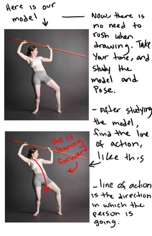
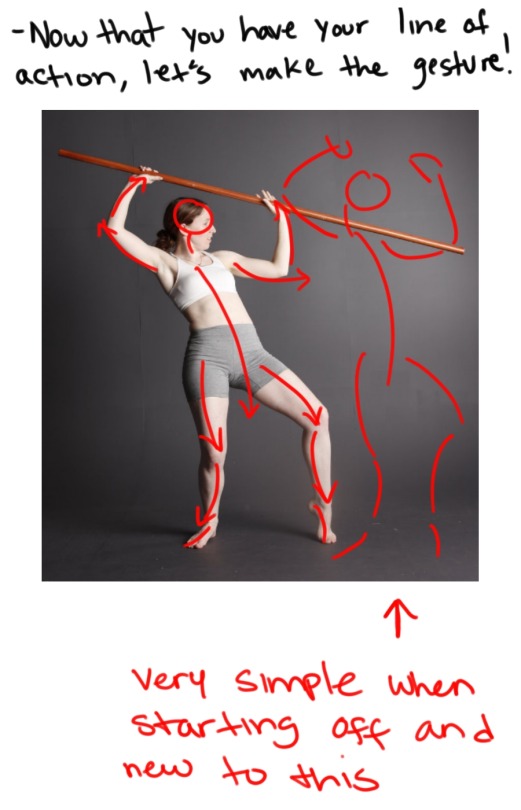
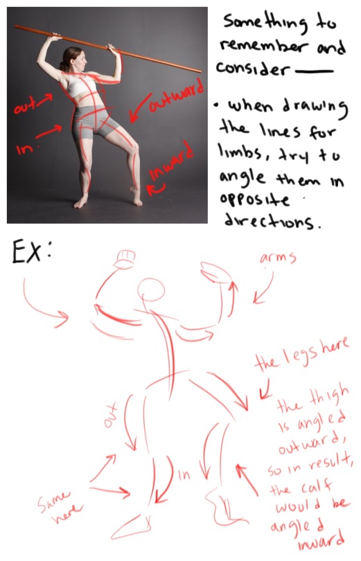
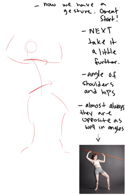
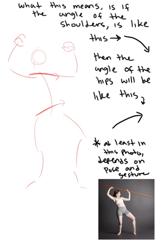
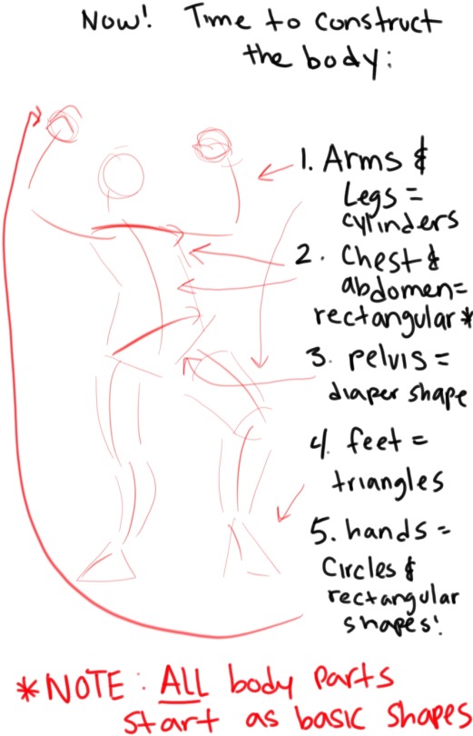
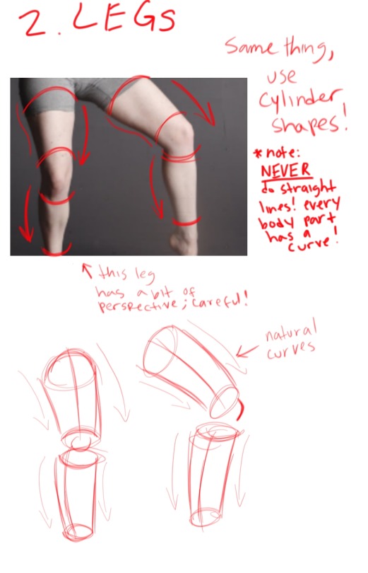
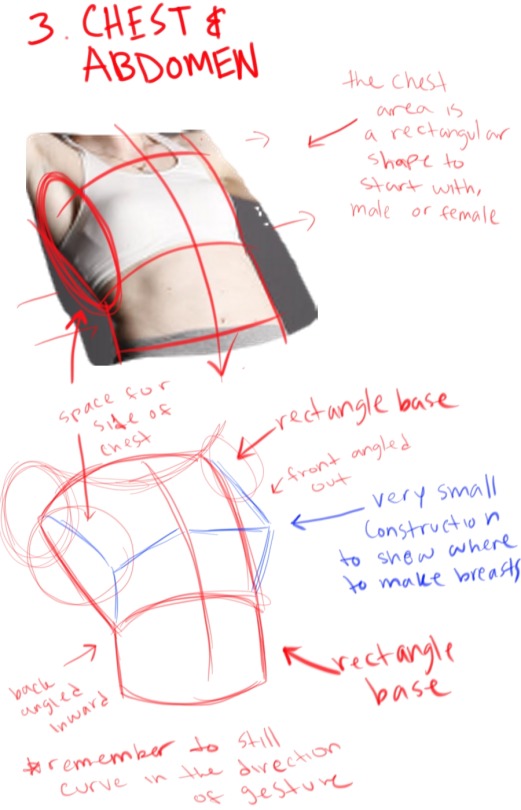
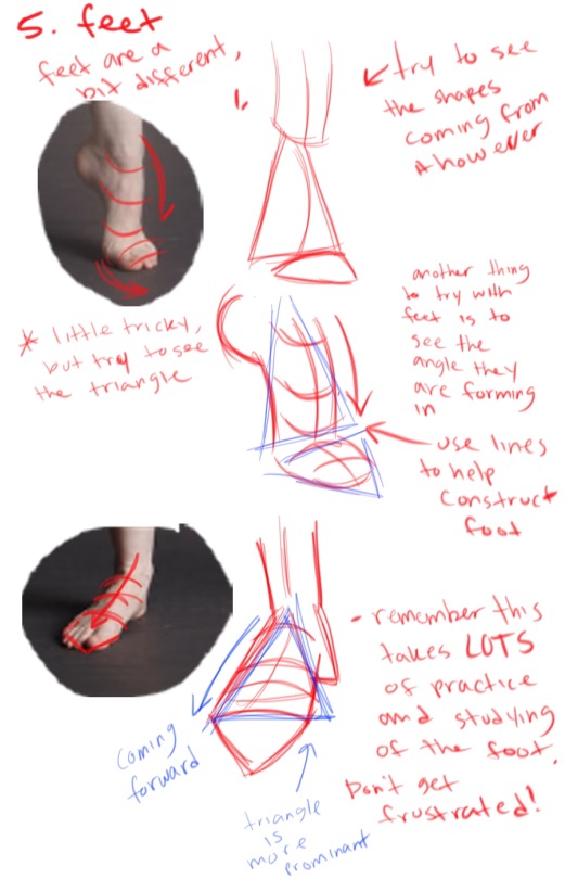
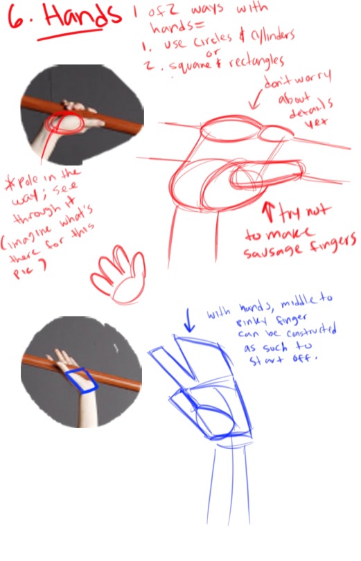
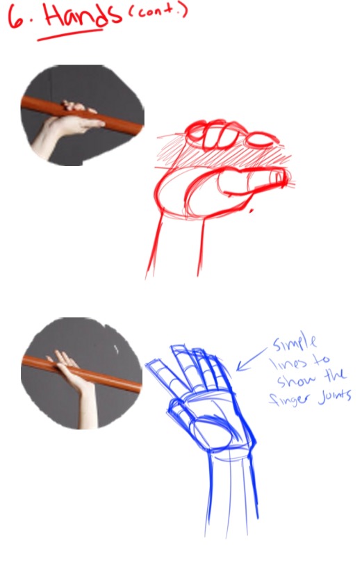
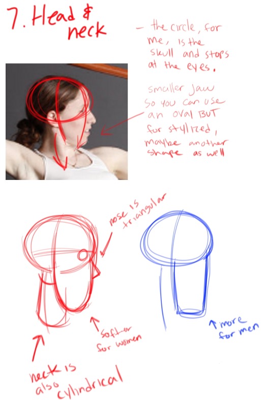
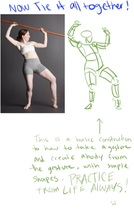
This is for basic body construction, try it from life drawing or from a website that have these life drawing poses! Remember, don’t rush the process and don’t feel frustrated when it isn’t perfect, it takes lots of practice!