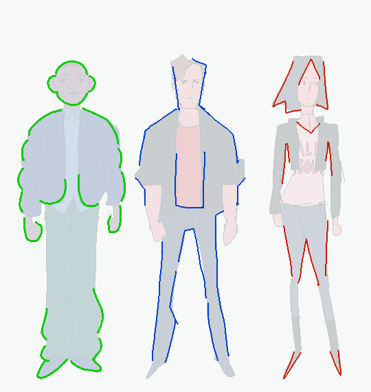
For artists who have problems with perspective (furniture etc.) in indoor scenes like me – there’s an online programm called roomsketcher where you can design a house/roon and snap pictures of it using different perspectives.
It’s got an almost endless range of furniture, doors, windows, stairs etc and is easy to use. In addition to that, you don’t have to install anything and if you create an account (which is free) you can save and return to your houses.
Tuesday Tips – Half and Half
A technique I apply to help me draw the torso/hips area as well as the face. Splitting it in half helps me compare the width of mirrored features on the the other half. Also very useful when the body twists and folds on itself. Norm #grizandnorm #tuesdaytips #100tuesdaytips #halfandhalf
Tuesday Tips – With a Twist!
Add some vitality to a pose by twisting parts of the body. A little or a lot. Give it a shot. #Norm
#100tuesdaytips #WithATwist #grizandnorm #arttips #arttutorial
Thanks for the patience, had to mull this one over. The more complex a design gets, the more difficult it is to break down. Basic character design tips may not be enough…so let’s delve into:
Character Design Tips Part 2!
Before we start, it’ll help to read my last character design post, where I laid out four concepts: shapes,silhouettes,colors, and inspiration. In this post, I aim to build on and rephrase these in a way that hopefully makes it easier to apply them. I’ll be drawing examples from my Power Rangers (2017) fanart to illustrate my points.
(Disclaimers:)
(Ideally, you should already be comfortable with drawing people. If not, look into figure drawing, gesture drawing, etc.)
(Whereas my previous tips were more tried and true, the tips here are more my own thoughts, so they may be half-formed.)
(Again, these are not rules. They’re just tips to add to your toolbox; the more tools you have, the more versatile you’ll become.)
Without further ado, let’s start!
Based off what we know about shapes, silhouettes, colors and inspiration, I want to cover: lines and angles, external and internal silhouettes, values, and references.
1. Shapes => Lines and Angles
Last time, I laid out three basic shapes:round, box, and triangle.
Problem: limiting yourself to these 3 shapes can be useful and fun for simpler designs, but they may be too simple or look out of place on more complex designs.
Solution: let’s go to the next level! Instead of shapes, shift your thinking to lines and angles!
Lines can be curved,straight, or diagonal. Angles can range from obtuse to acute angles. Follow your intuition: what feeling do you get from each line or angle? If I follow my own intuition, I see that:
curved lines = natural, soft
straight lines = balanced, grounded
diagonal lines = off-balance, in motion
obtuse angles = broad, relaxed
right angles = rigid, unnatural
acute angles = slim, dynamic
If this sounds familiar, you’re right! It’s just the shapes all over again:
curved lines make round shapes
straight lines with obtuse/right angles make boxy shapes
diagonal lines with acute angles make triangular shapes
But lo! Since we broke the shapes into their smaller components, it’s much more flexible! Now we can use lines and angles for more complex designs:
2. Silhouette => External and Internal Silhouettes
Last time, I explained the silhouette test: if you black out the figure, it should still be readable.
Problem: blacking out the figure only tests the outline of the design, i.e. the external silhouette. But what about the inside of the design?
Solution: block in the figure and test for the internal silhouette!
If you want not just an interesting outline, but an interesting costume, block in the major components of your design to see if it has a readable internal silhouette. This test can help you avoid boring or cluttered costumes and makes your design stand out. If your internal silhouette is too empty, try adding props or designs. If it’s too busy, simplify it.
3. Colors => Values
Last time, I talked about the 60-30-10 and 70-30 rules for color.
Problem: those rules work on the assumption that you’re only using 2 to 3 colors. But what if I want to use more colors?
Solution: good news! The same idea applies if you split your palette into 3 major values: shadows,midtones, and highlights.
Balance your palette by converting your colors to grayscale and applying the 60-30-10 rule to the values. This is related to the idea of silhouettes; if you get a nice internal silhouette, you’ll probably end up with a nicely balanced set of palette values, and vice versa.
“Good artists copy, great artists steal!” -Picasso
Problem: Coming up with something 100% original is tedious and doesn’t always give great results. It saps the inspiration right out of you!
Solution: It’s a lot easier to steal ideas from references!
Note: don’t just copy, steal! Cherry-pick/massage the aspects of the reference you find the most appealing and work them into your design. Ditch anything that you don’t care about. Make it your own! Make it something you can put your own name on! Below is the reference image I used for my designs:
And below is my fanart:
That’s it for now! Thanks for reading! If you guys want to see any other topics, feel free to ask and I can try my hand at it.
If you want to see my previous character design tips, click here. If you want to see the full-size Power Rangers fanart lineup, click here. If you want to see other character designs I’ve done, click here.
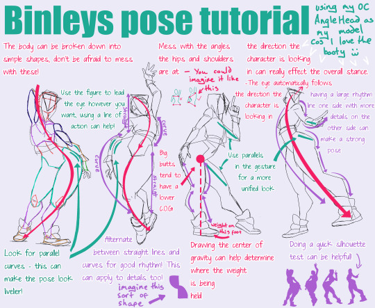
Here you go buddy!!! I mean this is by no means a how-to, more just random tips that may be helpful to apply to your style! Also please bear in mind I massively over exaggerate butts and thighs and this may not be something you are into lmao
OKAY SO! @biazerod asked me a little help on storyboarding and i decided to make this tutorial…i’m not a professionist. so don’t take these as golden rules…just advices! and as always sorry for the english
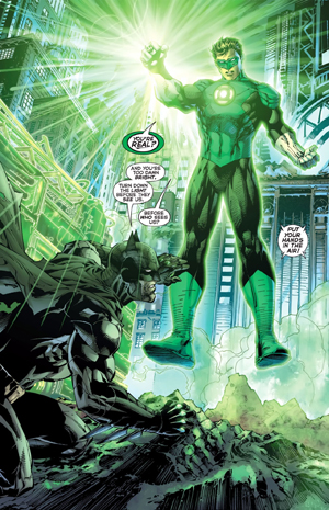
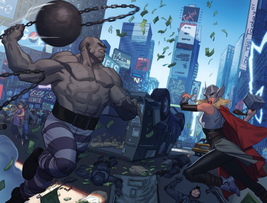
FIRST THING FIRST! the storyboard part is the most important phase in a comic page ! you can spend an entire day storyboarding! because it’s the structure, the essence of the page! here’s some tips : 1- a page can start from 1 panel/frame (called splash page!) until how many f*cking panels you can fit ! (some pages , especially in french comics/bd can reach 24 panels/frames!) Exaple of splash pages:
(these are from the green lantern,DC and the newest Thor ,marvel ) Splash pages are a priority of American comics, you rarely can find them in french Bd ! they represent a scene of impact! a fight! a revelation! be careful! use it only one if two times on a range of 50 pages! cuz it cut the narration! instead in french bd you find this :
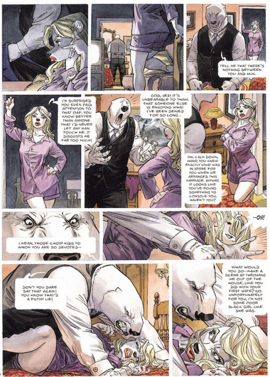
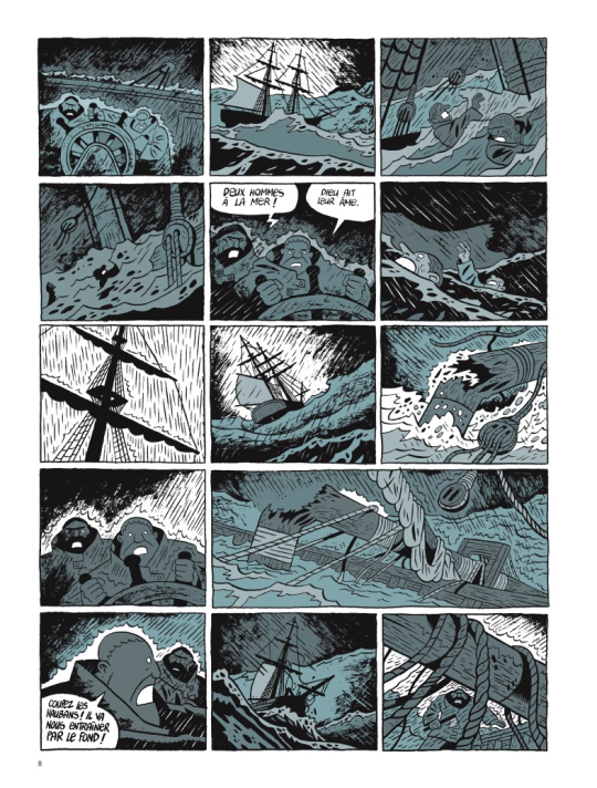
first one is from Blacksad 2# and second one is from Atar Gull see how high the number of the frames is??
the number of frames is very important in a page because it decide the narration time! 😀 also it all depends on the kind of ‘’direction’’ you want to use on your comic! so be really careful when you decide the number of the frame! LET’S PASS ON THE CREATION!
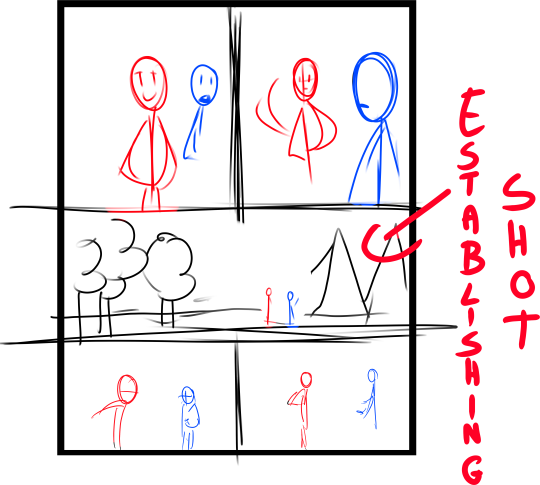
1- when you have a page that contains more than 3 Frames ALWAYS. ALWAYS HAVE AN ESTABLISHING SHOT!
the establishing shot is fundamental! BECAUSE READERS CAN UNDERSTAND WHERE THE CHARACTERS ARE!
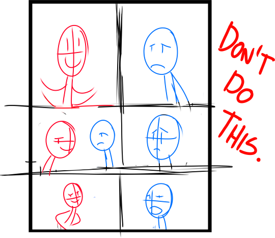
DON’T DO A COMIC PAGE FULL OF FACES !
DON’T DO THIS! LET THE CHARACTER BREATH! LET THE READER BREATH! PLAY WITH YOUR CAMERA! YOU HAVE THE POWER! in a comic page, is important to put the camera far away from the character most of the time! play with the different shots!
(found this on google) WATCH MOVIES AND TV SHOWS. lot of them can help you so much you have no idea! a comic artist and a director do the same job when creating a story
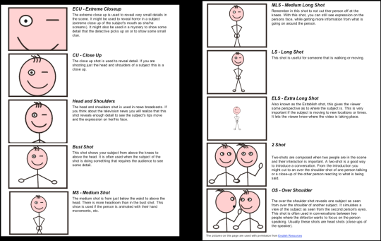
2- Candy eye this is a tricky trick that can help you with the audience! when a character is saying something important or you have to introduce them , USE THE CANDY EYE DUDE.
the candy eye is , basically, a bust shot where you show the character,their features , usually with a cool or a funny expression ( or of course it depends from the situation) and believe me WORKS 10/10 with the audience 😉
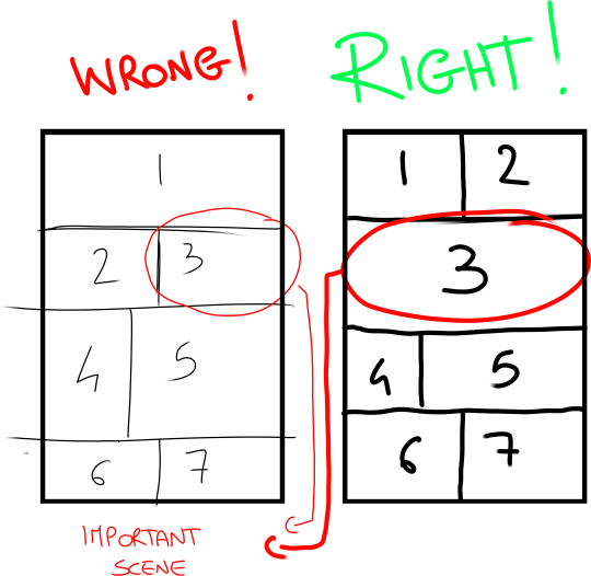
3- HIGHLIGHTS THE IMPORTANT SCENE IN THE PAGE!
FINAL TIPS: – when you’re doing dinamic poses try and try again! the first one isn’t always the best! -USE REFERENCES. –A STORYBOARD PAGE CAN REQUIRE EVEN 4 HRS IF NOT AN ENTIRE DAY IF NOT AN ENTIRE WEEK. REMEMBER THAT THE STORYBOARD IS THE ESSENCE. AND THE REST IS DECORATION. – IMAGINE THE SEQUENCE! NOT THE SINGLE PAGES. THINK IN SEQUENCES! imagine what would happen after the page you are creating! connect the various pages NOT THE SINGLES FRAMES ! YOU’RE CREATING A STORY! NOT A SINGLE ILLUSTRATION! -AGAIN DON’T DO PAGE OF FACES. most important thing:
if the page you’re creating it stresses you! STOP. continue it when you are in a better mood ,dude. our job requires lot of time and effort, but it should be the job we love. so don’t stress yourself and keep calm.
hope this is useful. don’t take this as golden rules, this is just the way i work 🙂
it’s been a while since my last tutorial! i hope that you can find this helpful. this previous video explains a bit more about the dropper tool method i use to blend: X
Some crying tips. I’m pretty bored of seeing movies with clean crying, but wow it’s by no means clean. It’s gross and messy and just downright fun to draw.
Yes!!! Also, practice drawing scrunched up noses people.