Well, I’m still learning myself, but here’s a few tips I usually keep in mind!
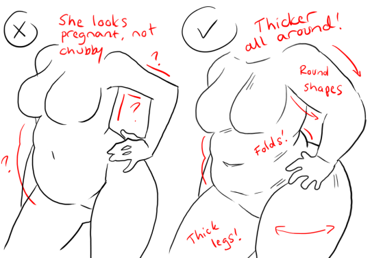
1.) “Fat” is not just a big belly!
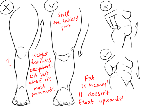
Fat distributes everywhere, but not necessarily equally! Like at
any weight, every body is different and has an unique shape! Some keep a
hourglass shape, some become more pear-like, some are shaped like
teardrops or apples… but the basic thing is, fat doesn’t just choose
one place where it WON’T gather. It may not be as visible in some area
compared to another, but in real life, it’s reeeeaaaaalllllyyyy rare to
just find a person whose fat only stores in their bum, thighs and tits,
leaving their waist, arms, neck and etc slim. Keep the body pleasant and
thick all around, not just in the places where the weight-gain is the
most imminent!
Keep the round shapes in mind!
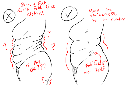
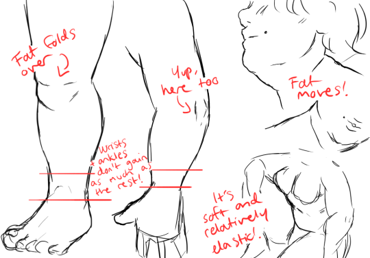
2.) Rolls! Folds! What are they?
What are they? Not something to be afraid of, that’s for sure!
Basically,
don’t hesitate to give your characters fat rolls. Skin folds, stretches
and moves along with the body, and so does the fat under it! However, a
lot of people who draw rolls tend to give the character many super
small ones — this is not how rolls work! Usually, the thicker the
person, the thicker the rolls — they increase in size, not necessarily
in number.
Rolls are the most preminent in places where the body moves the most, AKA the joints. Fat folds over itself and creates creases and ‘rolls’.
3.) HOWEVER….
(No references here, sorry!!!)
When we age, our skin loses its elasticity and it can’t keep the rolls and folds thick and perky. In our youth, our weight can be held up way better than in our elderly days due to the stength and adaptivity of our skin which disappears as we age. Thus, fat tends to droop lower with older people, and the rolls appear thinner. This can also happen if someone who has had a LOT of weight packed up suddenly losing a big chunk of it — the skin can’t adapt and will begin to “droop“ down and lower. Make sure to keep such factors in mind when drawing and planning how the weight of your characters should be carried!
And then, a lil tip that;
4.) Study references and real life!
If you yourself pack some weight or have access to internet, libraries or just life on the street, you will see how bodies at different weights and shapes work and move. Use references, see for yourself — try to find how fat distributes and especially, HOW IT FOLDS! Folds and rolls seem to be one of the biggest problems many have while drawing thicker characters, and that’s ok — we’re taught as a society that fatrolls are inherently bad and disgusting, therefore there are not many situations where we’d find ourselves just… staring and studying how the fat in our bodies works and moves. You’ll learn quickly, though!
I’m still learning myself, but especially since every body is different and the weight we pack acts in unique ways, it can be really challenging to find the ‘absolute’ right way to draw thicker characters. Don’t give up! You’ll get the hang of it eventually!!
I reference from photos for stuff I can’t visualize on my own, and artists like bouguereau, rockwell, leyendecker, mucha for mind fuel
Composition:
Whenever I do a piece, the objective I have in mind is to not get bored, because once I lose interest, I lose the piece.
So for me, the composition has to be distinct enough to avoid echoing an early piece, and to immediately be recognized due to its layout. It’s gotta be new for me, and new things are fun and exciting, right? (yes they are)
I think about the subject, the action, the actual format (whether it’s allegorical, objective, subjective, i.e. is it a symbolization, a certain scene, would you find it in real life? I tend to avoid the latter, because I find it dull and uninteresting and I hhhhhhhate that) I place priority on the human form, it’s versatile and expressive more than anything else, in my opinion.
Here’s an example. Normally I don’t post my sketches since they’re just glorified chicken scratch, but this is the best example I could think of at the moment. It’s St. George (for my series sanctus), and normally, you’d see him like this
(Saint George and the Dragon by gustave moreau, 1889-1890 )
or
(Saint George and the Dragon by raphael, 1504-1506)
this.
It’s a pretty common depiction, since it goes back to medieval times. The similarities are that he’s on a horse, he has a spear/lance, there’s a dragon, and he’s attacking it.
The big picture (haha pun) is that I wanted to also have my subject be st george (side note, it’s kind of the theme of the series), but different enough from past artworks where I’d know it wasn’t enormously reminiscent of the traditional depiction. So I aim to keep the basic idea, and see what goes on from there.
This is the first sketch I did, it was okay, I knew I’d never drawn anything like that, which is good, but composition was lacking. I wasn’t so hot about this, so I dropped it. I kinda like it so I might revisit it . Additionally, though, it strayed a little too far from the main idea.
Above was the second sketch, after I’d finished roughing it out, I knew immediately it wouldn’t do. I was satisfied for about 2 seconds, then I got disappointed and stayed that way.. If I put it side by side with the other million or so paintings of st george, I doubt I could tell it was mine. It was practically the same: horse, lance, dragon. The action was too similar to other portrayals.
Definitely….nah
It’s not as similar as the previous one was, but I didn’t like it. That’s a good indicator too, whether you like it or not. I’d tried to fuse the first and second sketch because I did like the first one somewhat, but it didn’t really work for me. It’s just so awkward …
So I left the piece for a while, and came back and did this. It was different, simpler (which can improve a piece more often than not), and I liked it. After I did most of the sketch, I said great job u idiot it only took you a week to come up with a sketch the hell is wrong with u, went to bed, and woke up happy, and normally it doesn’t take me 3 actual sketches or something to come up with a good piece, and I was getting pretty fed up before the last sketch, but good thing I didn’t give up (this time. hah) This is basically how I go about my pieces for now.
tl;dr Don’t give up! (haha I lied, go back and read)
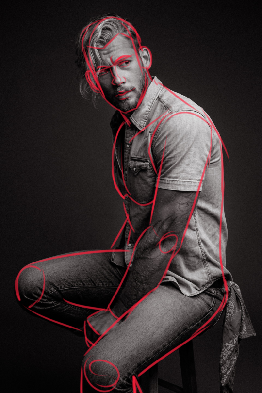
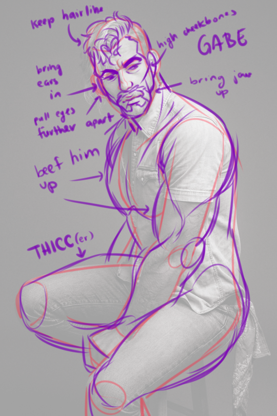
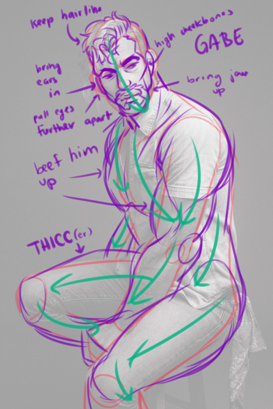
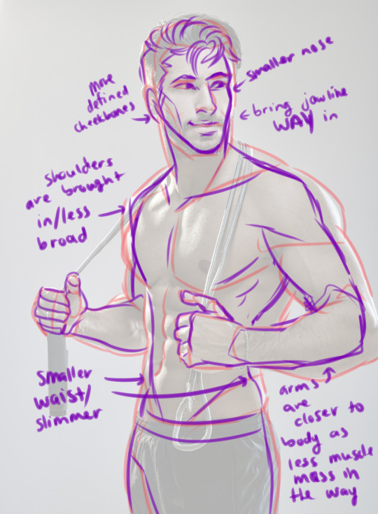
It is! I always make sure to try and break the pose into shapes and work from there. I also like to use arrows to show the flow of the pose!!! I then open it next to my picture and draw the shapes scaled up in size as I draw on a 4000px x 4000px canvas usually. You can also use posemaniacs.com for referencing,
if you scroll down the right side and click “model” it has hands, a torso, and a head for practicing with.
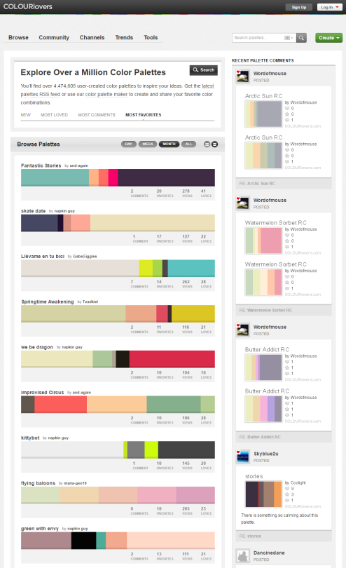
You can browse the most popular ones or search for certain colors, themes, and even specific hex codes!
When you find one you like, you can download a wallpaper swatch of it and also select the specific colors it uses to look at more palettes that use those same ones.
I got a lot of questions about how I did the blur/depth/light thing with the #HIXTAPE art I drew so here is a quick step by step:
1) fully painted drawing, Hobi’s hands and head/chest are on two separate layers
2) adjusted crop and composition, I cropped in closer to Hobi and I adjusted his hands to be in a different position that emphasized the “H” more. Also used a low opacity layer set to multiply and used a dark blue/purple to add some soft shadows to his hands where the back light would not be hitting them
3) Used filter -> gaussian blur on the head/chest layer to push Hobi in to the bg. Also duplicated the hands layer and blurred that as well, and masked out most of it saving only the bottom of his arms to emphasize his hands
4) Added a multiply layer and used a dark purple for most of his face and chest, and a pitch black on the very bottom to fade that part out completely. Added a tiny amount of light on him by using hot pink and small yellow dust specs, setting the layer to Lighten, and setting the opacity of that layer to really low.