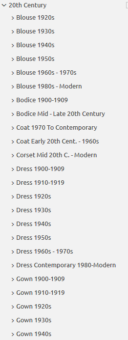
Do you design a lot of characters living in not-modern eras and you’re tired of combing through google for the perfect outfit references? Well I got good news for you kiddo, this website has you covered! Originally @modmad made a post about it, but her link stopped working and I managed to fix it, so here’s a new post. Basically, this is a costume rental website for plays and stage shows and what not, they have outfits for several different decades from medieval to the 1980s. LOOK AT THIS SELECTION:
OPEN ANY CATEGORY AND OH LORDY–
There’s a lot of really specific stuff in here, I design a lot of 1930s characters for my ask blog and with more chapters on the way for the game it belongs to I’m gonna be designing more, and this website is going to be an invaluable reference. I hope this can be useful to my other fellow artists as well! 🙂
Hi! I’m Matt Wilde, an old man from the North of England who has worked in visual effects, lighting, and rendering for games since the last century. Most recently, I worked on Variable State’s Virginia. Previously I was responsible for blood, magic, and urine in games as diverse as The Lord of The Rings Aragorn’s Quest (magic/blood), The House of the Dead: Overkill (blood/urine), and Dancing with the Stars: The Official Game (all of the above). Now I’m contributing VFX and rendering to In the Valley of Gods at Campo Santo.
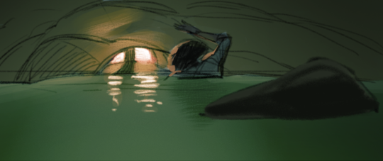
Putting together our announcement trailer provided plenty of challenges, but one thing I spent a fair chunk of time on didn’t actually make the final cut: a scene where Zora and Rashida wade through an ancient flooded passageway.
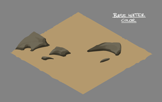
The starting point was this thumbnail sketch from art director Claire Hummel:
To bring the scene to life, we’d need nice-looking water, which wouldn’t be convincing if it didn’t react to the motion of the characters and surrounding geometry. A game that does this well is Resident Evil 7(especially if you’re a fan of floating corpses, like I am).
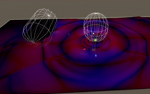
To this end, graphics programmer Pete Demoreuille (who apparently does exist even though he doesn’t have a Twitter profile) created a GPU-based simulation using a “shallow-water” approximation. It’s a little more accurate than traditional video game techniques, as it accounts for the water’s depth and computes its horizontal velocity along with height. For collision with the characters and the world, a “signed distance field” can be precomputed for the static environment, and characters are added in per-frame by attaching primitives (capsules, in this case) to bones in their rigs. Got it?
The end result is a number of dynamic textures which are fed into the shader for the water surface’s height, normal, velocity, and distance from a blocking object. Timo Kellomäki’s work on water simulation in games is a great reference.
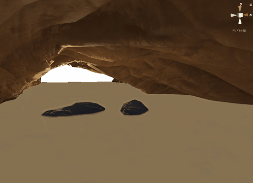
With these at my disposal, I set about making an actual shader, starting with a simple flow mapping texture—the flowing determined by the simulation. The output is brightened depending on factors like surface normal and velocity. The below was captured right out of the Unity editor and was immediately fun to play with. Imagine the capsule is a rubber duck, like I did. For about a week.
I gradually built this into a more watery-looking shader with the addition of normal mapping, depth-based transparency, caustic lighting effects, and probably some other things.
By this time the passage scene contained some first pass environment modelling and character animation, so I could try the shader out in situ. But first, Claire produced this handy style guide broken down into layers.
Isolating each element of the material was really useful in getting the final combined effect to work as we hoped it would. This is how it looked with the breakdown recreated in the shader:
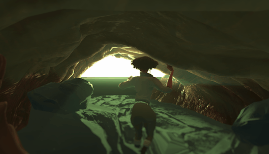
If you’ve worked with Unity shaders, you may appreciate that getting shadows to project onto a translucent surface is quite challenging. But I think it was worth the effort to enable the subtly visible geometry under the surface, fogged and blurred by depth.
With the characters and colliders added, the scene was as complete as it was ever going to get. The environment, character models and animation would all be updated in time, and I had plans to add particle splashes, water dripping from the ceiling, and a way to allow the characters to appear to get dynamically wet. But then, the devastating news.
The shot had been cut from the trailer.
Not one to take this kind of thing badly, I quickly brushed it off and it was really no more than a few months and a Balinese yoga retreat later and I was eagerly anticipating my next challenge. Dust motes? Oh no that’s great. Bring it on. I love dust.
Again this is my personal take on color! It really depends on the situation and what you personally value, and in the end practice is your best friend.
I drastically changed my colouring process over last year and atm i’m not using any fixed palettes. I always start with drawing the entire scene in greyscale:
(I find it easier to keep control over volumes, depths and contrast that way)
And now almost entire colouring process is based on adjustement layers.
I put any Gradient Map (set on Soft Light mode and something between 30-60% opacity) adjustement layer on top of it just to start with whatever:
and then i jump to Curves (my fav tool for colouring) – also added as an adjustement layer – and here i have most of the controls i need over each colour channel separately, so i just keep playing with it until i get close to what i like, very often just trying out various settings, I sometimes spend twice as much time on playing with this tool than on making an actual drawing, cos i often have absolutely no idea where i want to end up with colour XD This is how my “let’s try this now” folder for this piclooked like:
ekhm, anyways…
and then i play with it some more, sometimes using Colour Balance or Selective Colour adjustement layers too
(note: i always keep foreground and background on separate layers, or i make separate masks for each, so i can work on these independently if needed)
and voila:
I’m trying to leave a lot of some room for experimenting and accidental effects (trying out various blending modes and opacity settings) cos these can be very fun and surprisingly nice sometimes, but general rule i keep in mind is the contrast (contrast is always good) between colour temperatures. I have the contrast between light and dark already set in greyscale pic, so here it’s mostly about warm vs cool and most often it goes as: cool shadows / warm lights, cool background / warm foreground (or the other way around, but contrast).
i also like having one dominant colour in the pic so very often i grab selective colour tool and pump up that one chosen colour, sometimes even desaturating the rest of the image to push it out even more, but that depends on the pic.
Cheers and thanks! ❤
P.S.: i wanted to say i like using colour red most, but then i took a quick look at my gallery and i seem to like warm yellow / orange a lot too? especially if contrasted with colder blueish shadows.
I made a thing! I was thinking about this for a few days – because I realized that when I was young, I was also frustrated about being given the same advice over and over – without really knowing what it meant!!
Here’s 5 techniques which I have done before which have helped me grow as an artist, which are good for 5-minute warmups or just straight up challenges for your sketchbook!
Obviously, these are not the ONLY techniques – they’re just the ones I find most fun! And maybe they’re not the most ‘correct’ ones out there, but it’s better than another comic about practicing more, right?
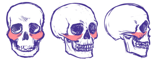
I’ve found that drawing the head starts to make a lot more sense once you start thinking about cheekbones and cheeks, and how the fit into the head structure.
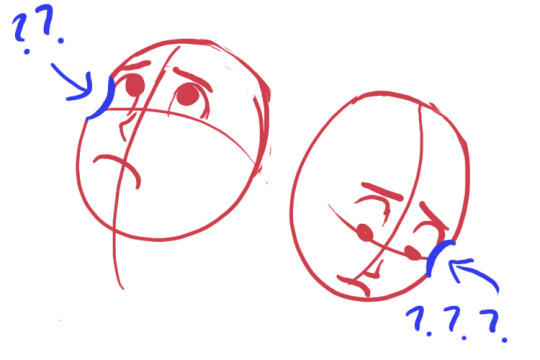
You might be aware of the Mysterious Indent that Looks Good Next to the Outer Part of the Eye, or the Mystery Indent for short.
Drawing a Mystery Indent may serve you fine if you only draw the head from flat angles, but it falls apart when you get adventurous.
Why isn’t this making sense anymore?
Drawing a ‘Mystery Indent’ is an attempt to imply cheekbones without knowing how they actually incorporate into the skull, and this is why it looks so unconvincing when you use it to draw the head in anything other than ¾ view.
The cheekbones wrap around the head and eye sockets from above the bridge of the nose. The concave you draw if you draw the ‘Mystery Indent’ is a misunderstanding. There is no concave. You should instead be thinking of this as where the eye socket/brow overlaps the (convex!) cheekbone.
Compare the cheekbones on both sides for placement. They should match up and correspond with each other.
(Knowing cheekbone structure helps when drawing gaunt characters, because their cheekbones may stick out. Remember to compare the cheekbone placement on both sides!)
* This is part of a much larger tutorial I’m working on about head, face, and facial feature structure. Hopefully more to come eventually?