Hmm you’re incredibly vague so I just did a process thing. Hope this helps! Also generally don’t shade with black/gray unless you know there’s a certain look you’re going for.
Et voila! Sweet little sugar free lolly gunslinger Kyle as reference :’D Feel free to change up the shadow colors to get different effects. Have fun!
ALRIGHT SO my pal @kalreyno wanted help with drawing fat characters and as a fat artist i felt like i could give a bit of helpful insight on that. there’s also been a lot of complaining about “boo hoo fat characters are hard to draw so i can’t include them in my work Ever” goin on lately so if that’s your case then this is for you too!! and also just for anyone who would like help with fat bodies in general, ofc. anyway, let’s get this show on the road!!
let’s start with some common misconceptions. these are the two main attempts at chubby bodies i run into, so i’ll focus on them.
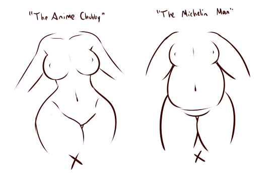
the Anime Chubby i see everywhere, and it’s just……so wrong in many ways. first of all, there is almost no additional body fat compared to your average thin character – except for where it’s added in “attractive” places (breasts, hips, thighs). the breasts are way too perky, and don’t have the realistic shape fat would give them (though how to draw accurate breasts is another tutorial all on its own lmao). there is still a thigh gap, which usually only happens in very thin people, and bones are still visible on the surface of the skin, which also rarely happens in fat people.
the Michelin Man is better in some ways, but still not that great. it’s a slightly better attempt, but basically all that’s done there is taking a thin character and blowing them up, while giving no thought to fat distribution. the thigh gap is usually still present, and they look a lot more hard than soft – and fat is very soft and pliable.
here’s a chart on how fat usually distributes (if you can’t read my messy writing, “1. next to no fat, 2. moderate amount, 3. most of the fat distribution”). basically, the more muscle an area has, the more prone it is to develop fat, such as the abdomen, thighs, and upper arms. it’s important to note that fat sits on top of muscle, and that it does distribute in different levels, and not evenly across the body as shown in the Michelin Man.
now, here’s an accurate fat body with all of that kept in mind!! notice how the fat isn’t only kept to aesthetically pleasing areas, and how it sits realistically on the character’s body. their breasts sag a lot more, which happens even in thin people with larger breasts, and the nipples are pointing more downwards than straight out. there is no thigh gap in sight, there are no bones in sight, and most importantly, they have fat rolls, which are very important in drawing a convincing fat character!! as far as i know i’ve never met a single person with no rolls at all, and everyone has them, whether thin or fat – they’re just more prominent and more consistently present in fat people. pay close attention to where they are and how they’re shaped.
here are a couple of drawings showing how fat is affected when sitting vs stretching. as seen in the first, the fat specifically on the stomach is distributed a lot more evenly and stretched out, so it becomes “flatter”. the love handles are still pretty visible, though, as well as the fat on the thighs and arms. the breasts are raised with the shoulders, and the fat on the shoulders and near the neck forms rolls as it’s being pushed together.
in the second, there is a lot less room for distribution, so the fat is all pushed together. the breasts sag and the stomach forms rolls and spills into the lap. a good analogy for the way fat works is to liken it to a water balloon, and thinking of how its shape would change when resting flat on a surface, hanging off of a ledge, held upright, etc.
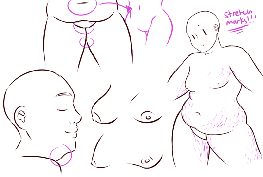
here are a few extra tips i find a lot of people miss!
first on the top is the hip/pubic region. the first circle is showing the way the bellybutton is folded in fat people, as opposed to stretched out in thinner people. the second is the stomach fat spilling over onto the pubic region and creating a separation in the two areas, which is something that’s missing in a lot of art. in addition, the pubic mound also gains fat, making it round as seen in the profile drawing i did up there
(i’ve heard people refer to it as fupa?). the last in the hip region is the lack of a thigh gap. i can’t stress this enough!!!! if you’re trying to draw a convincing fat character, make sure their thighs are pretty much always touching!! for reference, mine literally don’t separate until my feet are about 2ft from each other.
the bottom right is showing the double chin, which a lot of people are afraid to draw!! fat does distribute itself here too, and there’s nothing wrong with it, so don’t feel like you shouldn’t give fat characters a double chin in your work for fear of it looking like a caricature.
in the bottom middle, it’s showing how fat affects different types of breasts with the presence of more or less breast tissue.
lastly, at the very right are stretch marks with their usual locations and directions, which i also can’t stress enough!!!!! i sometimes forget to add them honestly, but they’re so important in accurately portraying fat characters, as they literally come from the skin being stretched from fat being gained (and they’re also just rlly neat lookin like why wouldn’t you lmao). some people have less and some people have more, feel free to experiment with them!
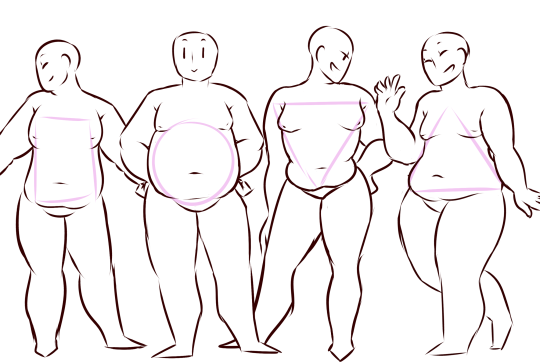
the last thing is body types!! there isn’t one single way for a person to be fat, so feel free to experiment with shapes once you’ve learned the basics!!
so there you have it, a tutorial on how to draw chubs!! now go forth and make some accurate fanart or some rad fat characters, because the world could always use more of both. hmu if you have any questions or concerns, and thanks for reading!!
EDIT: someone pointed out the bad wording in the tutorial. thank you for bringing it to my attention and sorry for offending anybody. i’ve updated the tut, so please reblog this one!
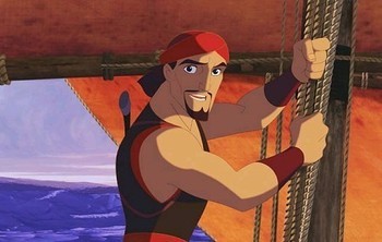
Here is an animator you may recognize as a certain horse riding a beach ball from Adventure Time, James Baxter!
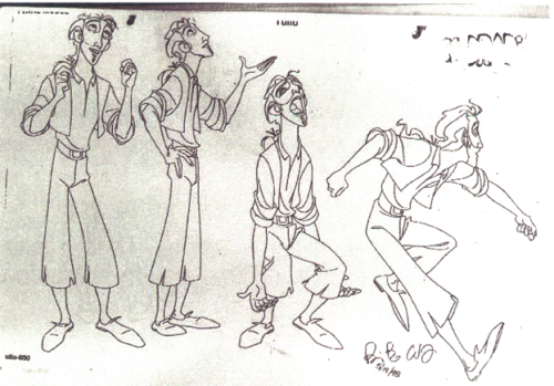
James Baxter not only did work at Disney, but also at DreamWorks and later got to voice and animate two episodes of Adventure Time with James Baxter the Horse! Here are many examples of his amazing work and even check out his blog on @jbaxteranimator!
The Rescuers Down Under (1990)
Character Animator for Joanna
Beauty and the Beast (1991)
Supervising Animator for Belle
The Lion King (1994)
Supervising Animator for Rafiki
The Hunchback of Notre Dame (1996)
Character Designer / Supervising Animator for Quasimodo
The Prince of Egypt (1998)
Animator for Moses
The Road to El Dorado (2000)
Senior Supervising Animator for Tulio & Animator for Chel
Spirit: Stallion of the Cimarron (2002)
Senior Supervising Animator for Spirit
Sinbad: Legend of the Seven Seas (2003)
Supervising Animator for Sinbad
Enchanted (2007)
Animation Supervisor
Kung Fu Panda (2008)
Animation Director for Dream Sequence
Gravity Falls (2012 – 2016)
Animator for Intro
Adventure Time (2010 – 2018)
Animator / Voice of James Baxter the Horse
Samurai Jack (2017)
Animator on Episode XCV
Holy crap
This dude’s awesome
WAIT HE’S THE REASON DIPPER IS SO FLUID AND EXPRESSIVE IN THE TITLE SEQUENCE????
Okay first of all, sorry to take so long to answer. I really wanted to draw some pics for this, and the last weeks have been quite busy.
1. Draw from the reference
Drawing is like learning a new language: You can’t say you wanna learn English and then just start making up your own words because you think that finding words in the dictionary is cheating – It doesn’t make sense. Find a super cool robot picture and try to copy it. These are called “studies” for a good reason. You’re studying the vocabulary of those drawings. Many times people don’t share their studies since it’s only for the practice. But don’t study just one person. You don’t want to become that person – you want to become better! And if you post your study online, don’t forget to credit the original artist!
2. Try different techniques
One of my favorite techniques is something I call color blocking – I’m not sure if it’s an actual term or just something I came up with. I kind of carve the silhouette of the robot with one color and then I add a second color and carve the details in. I do this also if I have a picture with lots of characters and I want to make sure everything reads correctly. But these are all personal matters. Try different techniques until you find a one that works for you. And remember to flip your canvas!!
3. Try different brushes
My favorite brushes vary, but these three are the ones I keep using more than the others. Kyle’s brush I got used to while I was working on my freelance work – it just feels good to draw with.
The square one is really fun to work with in mecha designs, and the basic one also feels surprisingly good while drawing. Sometimes I just grab a new brush, start doodling, and end up with a decent piece.
4. Symmetry vs. asymmetry
This one I included especially because I’m talking about robots. Breaking up the machines with asymmetrical parts gives them more character BUT it’s important to keep the symmetry in mind. If I do a robot that has a one big arm and one small arm, I later make sure that most of the other parts are symmetrical. This way the asymmetry is the choice rather than a mistake.
5. Draw from the reference (!!!)
Yes, I added this the second time because I really feel it’s important! I use Pinterest all the time – I have a board with over 1000 pins of robots! There are paintings from my favorite robot artists, 3D models of super cool robot designs, and even photos of real robots all collected in one place. And for anyone who feels “wrong” doing this: Finding reference DOESN’T mean copying – it can be just an idea or inspiration: It’s finding the language you want to use. Sure you won’t need the reference as much later on as you build your own “shape-vocabulary” – just like you won’t need your dictionary after you have learned the words you use.
6. It doesn’t have to be perfect
I’m never 100% happy with my work. But I have learned to say “oh well” and move on. Next time I’ll do better.
7. BE PROUD!
Don’t talk down your own work no matter how much you’d like to. If you’re not standing behind your drawings, who will? Sure you do see the mistakes, but it’s still a great piece of art you made!
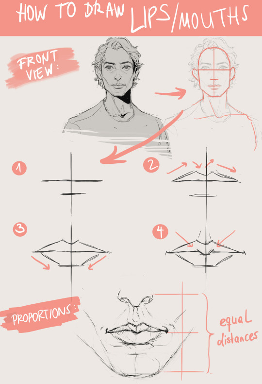
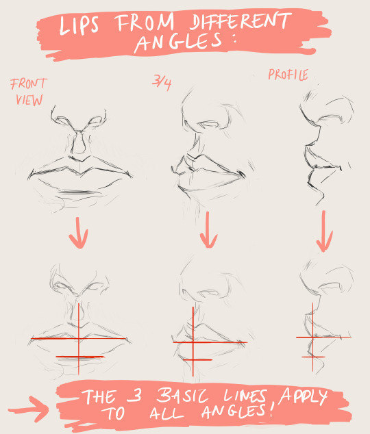
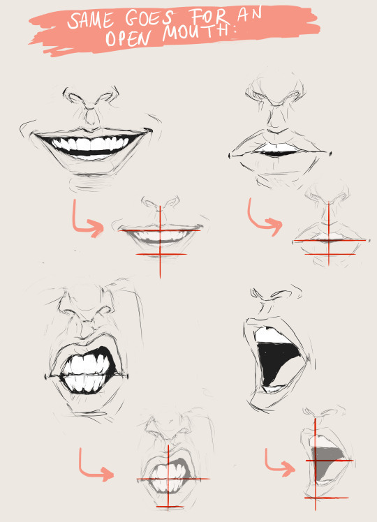
I’ve received a few of these messages over the past couple of months and they’ve motivated me to sit my ass down and make some sort of tutorial on how to draw lips. I’m not an expert, but I hope it’s helpful, and if it’s not, then at least you’ll know how I personally do it:
Type in your terms and preview the videos, taking screenshots to use as reference of the exact moment you like. This way, you won’t run into exact reference copying (since it isn’t a photo) and the poses tend to be more dynamic.
Hey readers, if you’ll humor me… What are you preferences these days for keeping up with new content from creators and artists you follow? Do you rely on push notifications from webcomic apps at all? What social media platforms do you like best?
I’ve found tumblr to be a pretty ideal place for sharing art up until this point. It’s been my go-to spot to notify followers of new stuff almost specifically because it doesn’t behave like Facebook, but I’ve got the sudden, sad impression the developers here are now dabbling in the FB algorithmic spice rack – Hmm. What magic ingredients make that unnavigable hellscape so relentlessly frustrating, and how can we too make it difficult for creators to reliably reach their followers?
I’m talking about the Best Stuff First feature/scourge, of course…which makes me think perhaps it’s time to seek out other venues.
Follow up – Hey, thank you everyone who responded! You’ve given me some things to look into and think about (like Pillowfort and Mastadon). Also, far more people rely on RSS than I thought. All good to know. It’s much appreciated!